Branding for accountants: how Sampson Fielding went from DIY to distinctive
A professional services rebrand done well doesn't just look better, it works harder. Since we completed Sampson Fielding's brand strategy, identity and website redesign, the firm's monthly active users have grown by 325% and organic search traffic has increased by 975%. This is the full story of how we approached the brief, what we built and why it's still performing three years on.
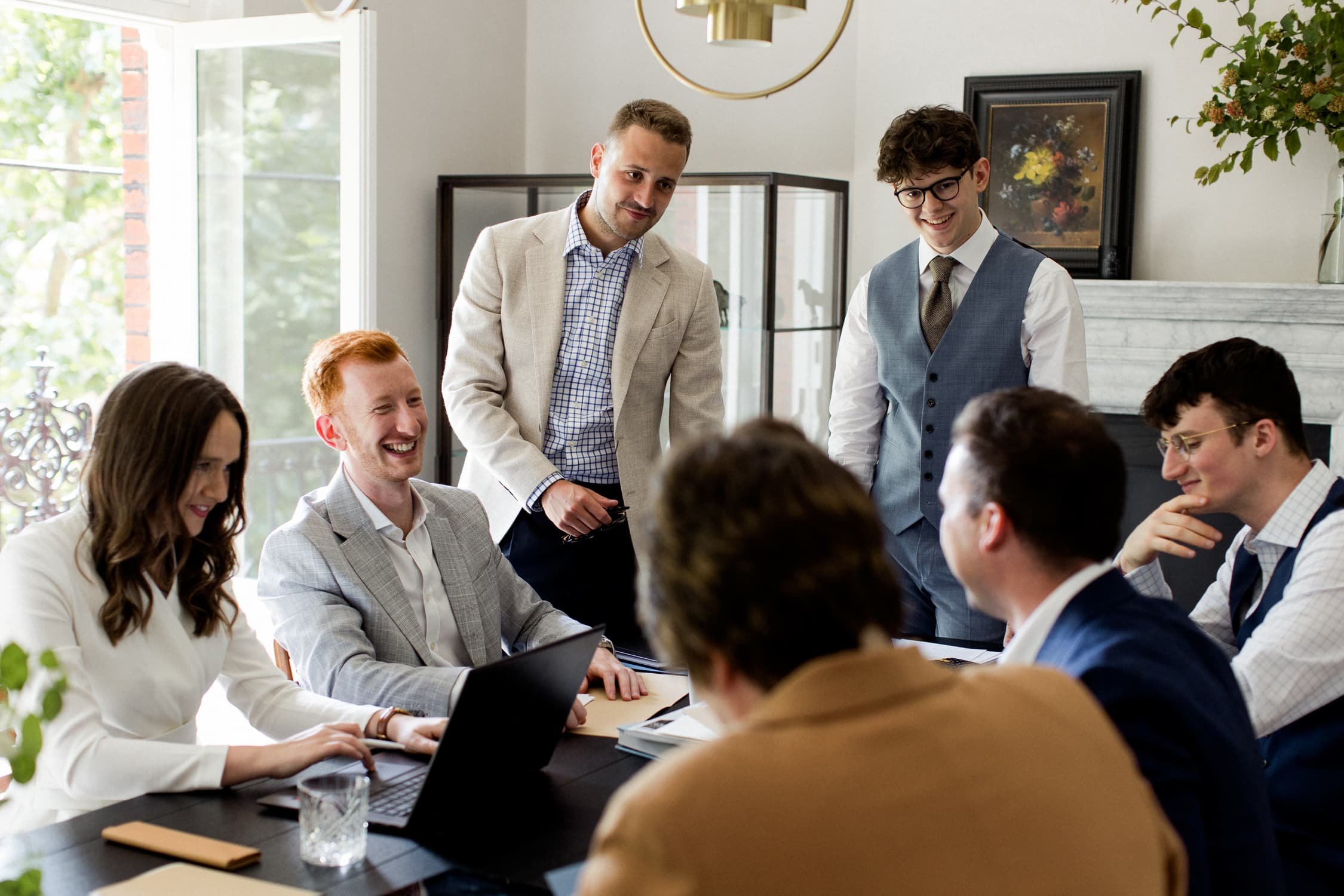
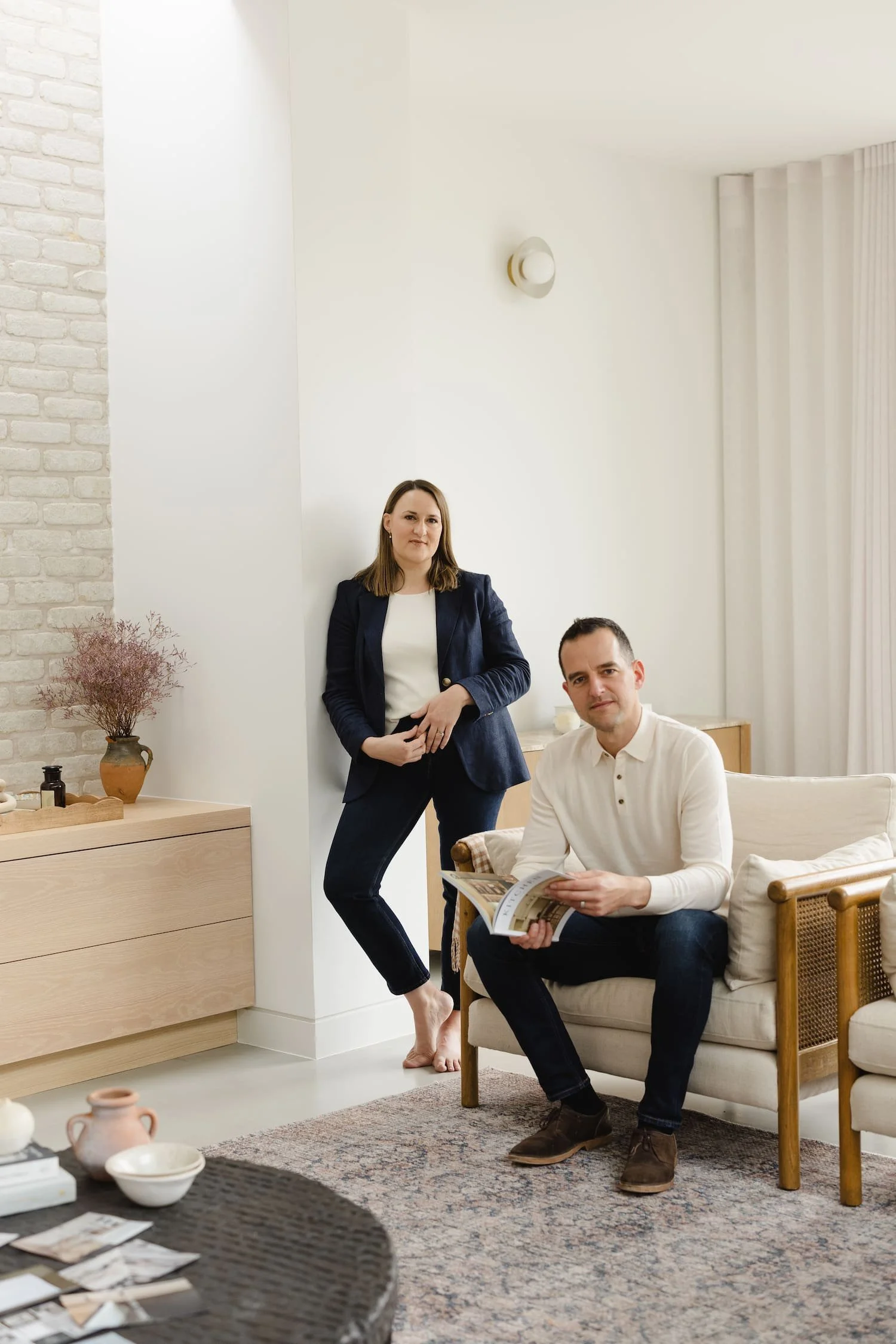
Aoife, Giordan, Elliot, Xander, Ben, Benjamin and Lyndsay in the office
Key takeaways on branding for accountants
A DIY brand becomes a liability before you notice it's happening. Sampson Fielding had genuinely outgrown their start-up identity; not because it was badly made, but because the firm had moved far beyond it. By the time a growing professional services business realises its brand is undermining it, it usually already has been for a while
Competitor research reveals positioning gaps that gut instinct misses. The Sampson Fielding brand wasn't built on what looked nice; it was built on a thorough analysis of what competitors were and weren't doing. The niche we found (expert advice + exceptional personal service + values-led practice, done simultaneously) became the foundation of everything
Brand strategy comes before identity. The visual work (logo, colour palette, typography) only landed as well as it did because the strategic work had already clarified who Sampson Fielding were for, what they stood for and how they differed from competitors. Without that foundation, the identity would have been decorative rather than purposeful
In professional services, the About page is doing more work than you think. Three years after launch, the About page remains the second most-clicked page from Google, ahead of Services and Contact. People hiring accountants want to know who they're dealing with. An identity that makes your team feel approachable and credible isn't a nice-to-have; it's a conversion tool
A well-built website compounds over time. Organic search traffic is up 975% since launch and Google impressions have more than doubled in the last 16 months alone. That's not a spike, it's the SEO foundations laid in 2023 doing exactly what they were designed to do, three years later
Every client touchpoint is a brand moment. The management accounts templates. The business cards. The Excel workbooks. When each of these carries the brand through consistently, it builds the kind of quiet confidence that turns clients into long-term retainers, and long-term retainers into advocates
1. The accountancy firm behind the numbers
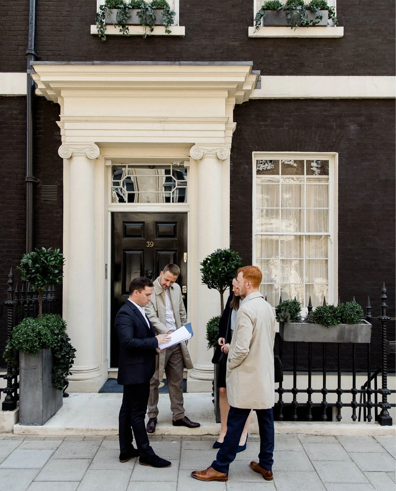
Ben, Elliot, Aoife and Giordan together in Mayfair
Like so many founders who are brilliant at what they do, Elliot Fielding and Ben Sampson from Sampson Fielding had put together a logo and a website to get things off the ground. They then fell into the all-consuming work of building a really good brand. A mere two years later they got in touch with us.
By the point, their initial start-up energy had turned into real momentum: their firm had grown considerably; they had a clear sense of who they loved working with; and they knew exactly where they were heading. Their five-year ambition was to rank on the Accountancy Age Top 50+50, open a second office and build a 30-strong team with a reputation for exceptional service. What they needed was a brand that matched both where they already were and where they were going.
Sampson Fielding isn't your typical accountancy firm. They believe accountancy goes far beyond the numbers. They built their practice on personal relationships, proactive advice and the kind of honest, straight-talking service that makes clients actually enjoy hearing from their accountants. However, none of this was obvious in their existing brand.
In short: When your firm has outgrown its original brand, the brand stops being an asset and starts being an obstacle; however good the work behind it is.
2. What wasn't working

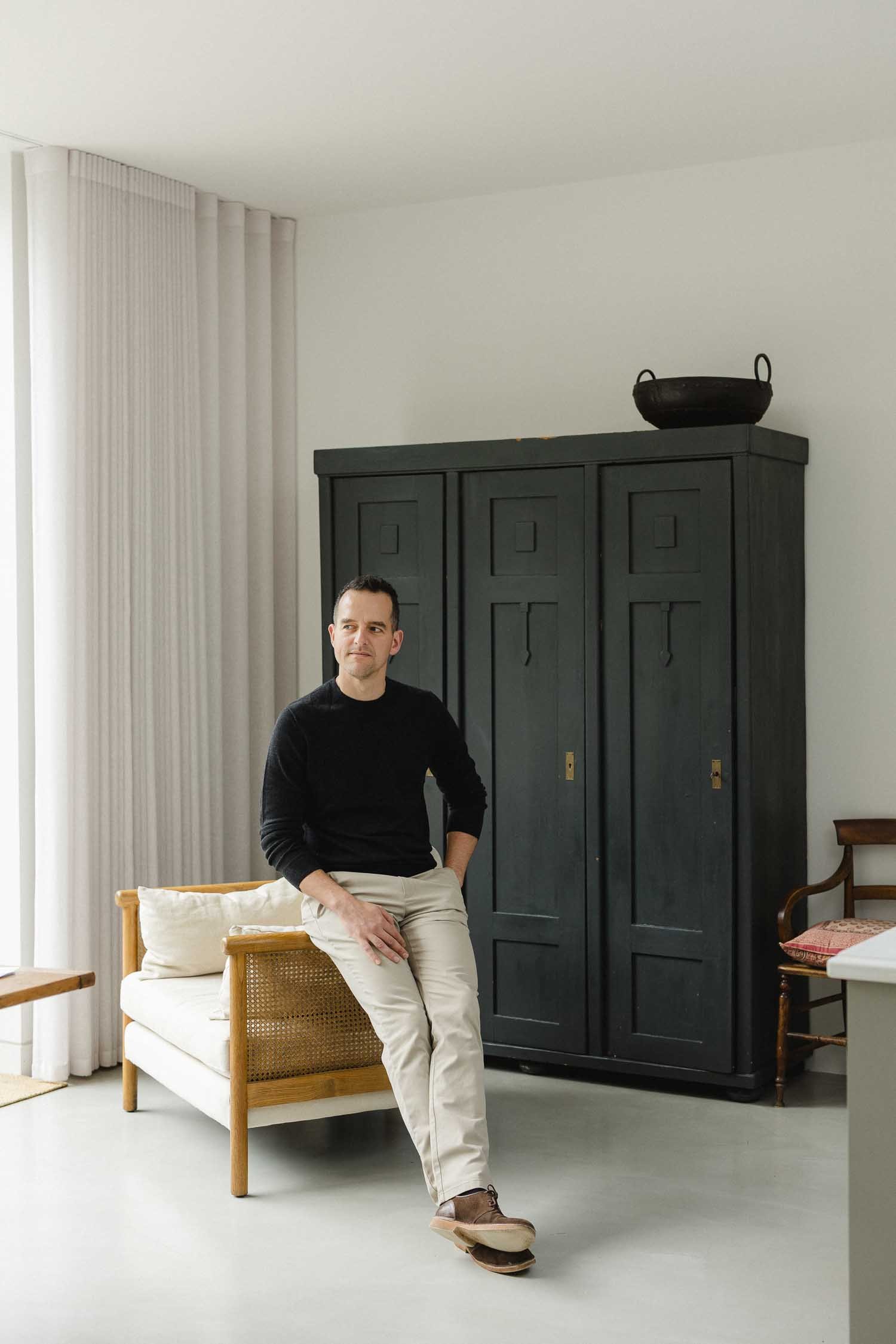
Ben from the Sampson Fielding team on the phone in Mayfair
Their old brand undersold them and they knew it. A DIY logo and a basic accountancy website can only get you so far, but then it starts to become a liability, especially when when you've got big ambitions and want to attract much higher end clients and quality staff talent.
There were some specific tensions:
The positioning felt off
Elliot and Ben were very clear that they didn't want to be defined by the dry, compliance-heavy image that dogs traditional accountancy. They wanted their new accountancy brand to reflect the modern, tech-savvy, client-first practice they'd built; one where clients see beautiful, clear online reports rather than dense documents. They even pushed back on language: "We don't like the term chartered accountancy"; they wanted to be a firm of Chartered Accountants; precise and proud of it.
The look didn't match the aspiration
When you're positioning yourself as high-quality, persona and aspirational (and planning to compete with the likes the top city accountancy firms) your accountancy brand needs to do that positioning work before a potential client even reads a word.
The website wasn't converting
When someone referred a business owner to Sampson Fielding and they headed to the website, it needed to confirm everything they've heard up to that point. It wasn't doing that job.
In short: In professional services, looking like everyone else isn't neutral; it actively undermines the trust you've spent years earning.
3. How we approached it

Aoife from the team holding a set of notebooks
This was a comprehensive project from the ground up (brand strategy, brand identity and a complete website redesign) and we started with the strategy, which is where all great brands begin.
Over a series of consultation sessions, we delved deep into Sampson Fielding. We mapped their brand purpose, values and vision. We fleshed out detailed audience profiles for the three clients they most wanted to reach (the growth-focused CEO who needs reliable financial clarity; the established business owner who wants professionals he can trust without constant input; and the high-earning professional who needs expert personal tax advice and someone to grow with her). We then examined local competitor accountants to find the niche in which Sampson Fielding could stand out.
What became clear was that Sampson Fielding's real opportunity sat at the intersection of three things most firms do separately: expert chartered accountancy; exceptional personal service; and honest, values-led practice. We built the whole accountancy brand around that convergence.
The brand archetype we landed on was The Sage
Authoritative, expert, trustworthy and decisive. A firm that educates and guides rather than just processes. One that clients come to because they know they'll get genuinely good thinking, not just compliance paperwork.
The positioning statement
Proactive, personal and honest. Simple, but precise, and completely at odds with how most London accountancy firms present themselves.
The tagline
Empowering Growth with Proactive Accounting. It says what they actually do for clients, not what they are.
In short: Brand strategy isn't a creative* exercise, it's a commercial one. The visual work only lands because the strategic thinking happened first.
*OK, not solely, as it definitely requires some creative thinking!
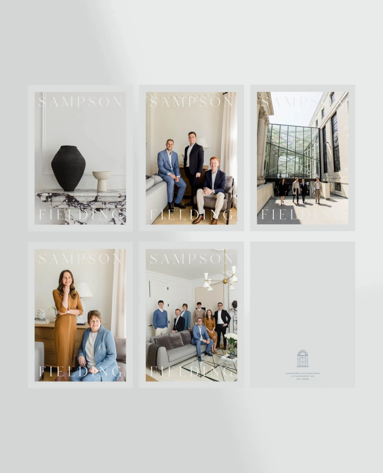
4. The identity
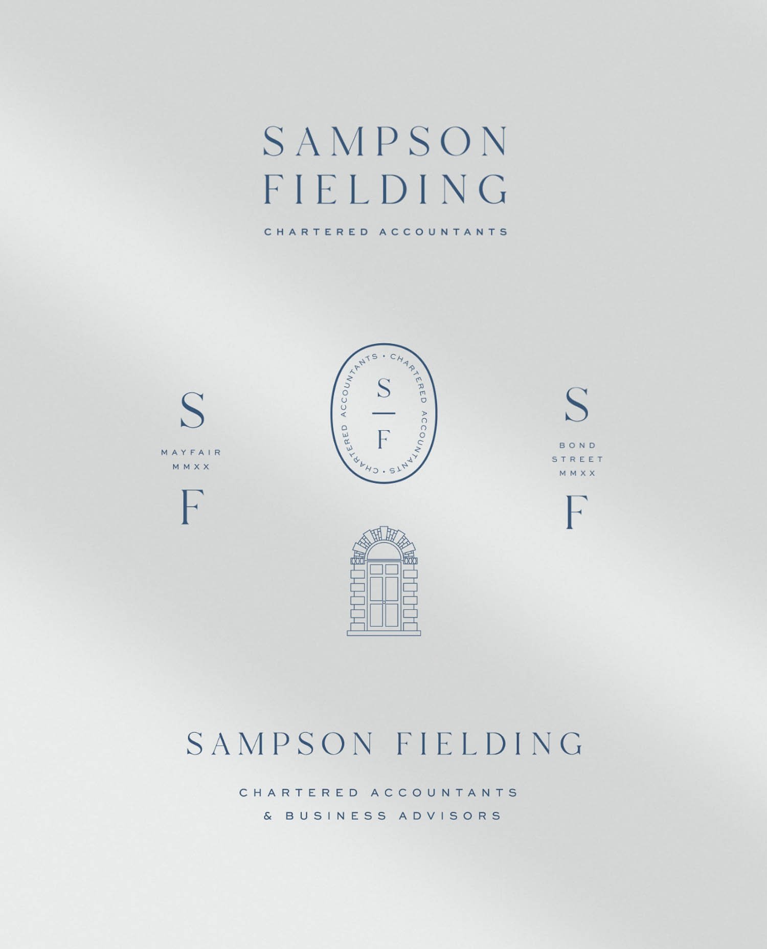
The Sampson Fielding logo suite
The logo is set in a custom typeface with unique ligatures. Stacked, spaced generously and paired with a refined "Chartered Accountants" sub-line in Sweet Sans Pro, it reads as simultaneously traditional and modern; exactly the right positioning for the accountancy firm they wanted to be.
A classic Mayfair arched doorway
One of our favourite touches is the door icon - a fine-line illustration of a Mayfair door. It nods to their central London location with a quiet confidence that doesn't feel showy.
The colour palette
We specifically named rather than numbering their colours, which gives you further insight into their brand.
Ivory and Lead White is the base
Caramel (a warm, burnished brown) brings sincerity, honesty and an aspirational quality
Blue and Navy for trust, efficiency and focus
We even thought about how the colours could work across their service areas:
Navy anchoring business compliance
Blue for consultancy
Caramel for personal tax
This allows the brand eventually to stretch into colour-coded client communications and stationery.
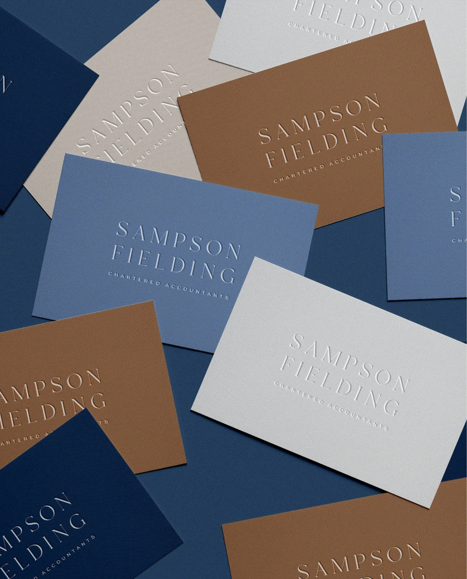
A variety of Sampson Fielding business cards
Typography
Nocturne Serif Light for headings: elegant, editorial, traditional but with a contemporary edge
Sweet Sans Pro for body copy
The combination gives the brand the warmth of a financial firm that actually talks to people, rather than at them.
The brand season
We settled on summer with a hint of spring: refined, understated, and natural. Light-filled photography. Warm textures. Nothing corporate, nothing clinical.
In short: Every design decision (a typeface, a colour name, a door icon) should have a reason behind it that connects back to what the business is trying to say about itself.
5. The work
Sampson Fielding branded lifestyle photography
The website was built on Squarespace and covers the full suite of pages that an accountancy firm would require (Home, Services, About Us, Careers, Blog and Contact) with both a general enquiry form and a dedicated graduate application form.
The services pages were written and designed to speak directly to each of their three ideal client types, using the language and pain points we'd mapped in strategy. No corporate-speak. No dry descriptions of what a tax return is. Instead: why it matters to your business and what changes when you work with people who are truly proactive.
The About Us page was important. Sampson Fielding's brand is built on the people in it; and a key differentiator we identified from their competitor research was that every firm either felt faceless, corporate or overly casual. Sampson Fielding needed to feel personal without being informal: real faces, real bios, real personality; but with the gravitas of a firm that means business.
The Careers page was built to attract the graduate ACA/CTA talent they were actively recruiting; and to signal that this is a firm serious about developing the next generation.
Sampson Fielding’s business positioning emphasises personal relationships, honesty and a service that makes clients actually enjoy hearing from their accountants, so it was important to us to have website imagery that reflects the way Ben and Elliot want to conduct business. We didn’t want the images to feel corporate, cold and clinical - or worse still, use stock photos, which so many businesses do. We briefed against stuffy board rooms, slick city images, arms-length corporate sheen; we wanted to cut through predictable image style of accountant firms and instead do something unexpected.
The team invested in a multi-day photo shoot. We partnered with a brand photographer we knew would the capture warmth and sincerity of the people within the business, convey personality, trust and deliver a beautiful set of images of the city they work in.
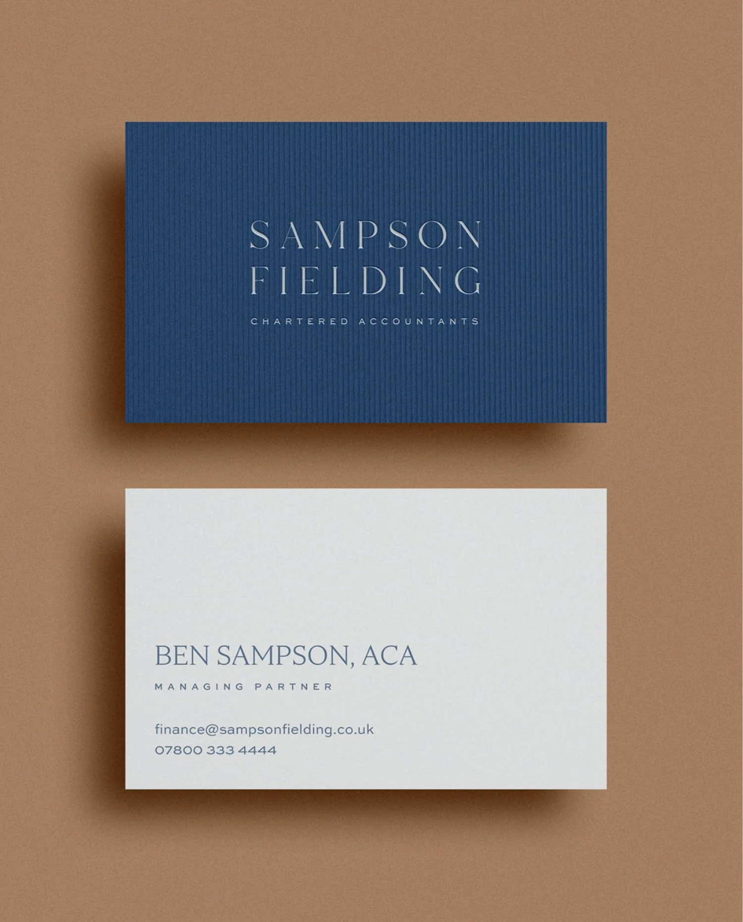
Front and back of Sampson Fielding business cards
The business card deserves a mention of its own. Printed on GF Smith Colorplan Cobalt with a blind embossed logo on the front and a crisp, personal reverse, these are cards that make an impression in the hand of a potential client. We specified GF Smith paper throughout (FSC-certified, UK-made, beautifully tactile) because every touchpoint should reinforce their premium accountancy service.
We also designed their client-facing Excel documents and management accounts templates. Even the reports that regularly go out to clients should look like they came from an accountancy firm that cares about the details. Each one opens with a personal introduction page featuring the team member who prepared it. That's the kind of brand detail that builds loyalty.
In short: The website pages most businesses treat as afterthoughts (About, Careers, client-facing documents) are often doing the most important commercial work.
6. What happened after launch
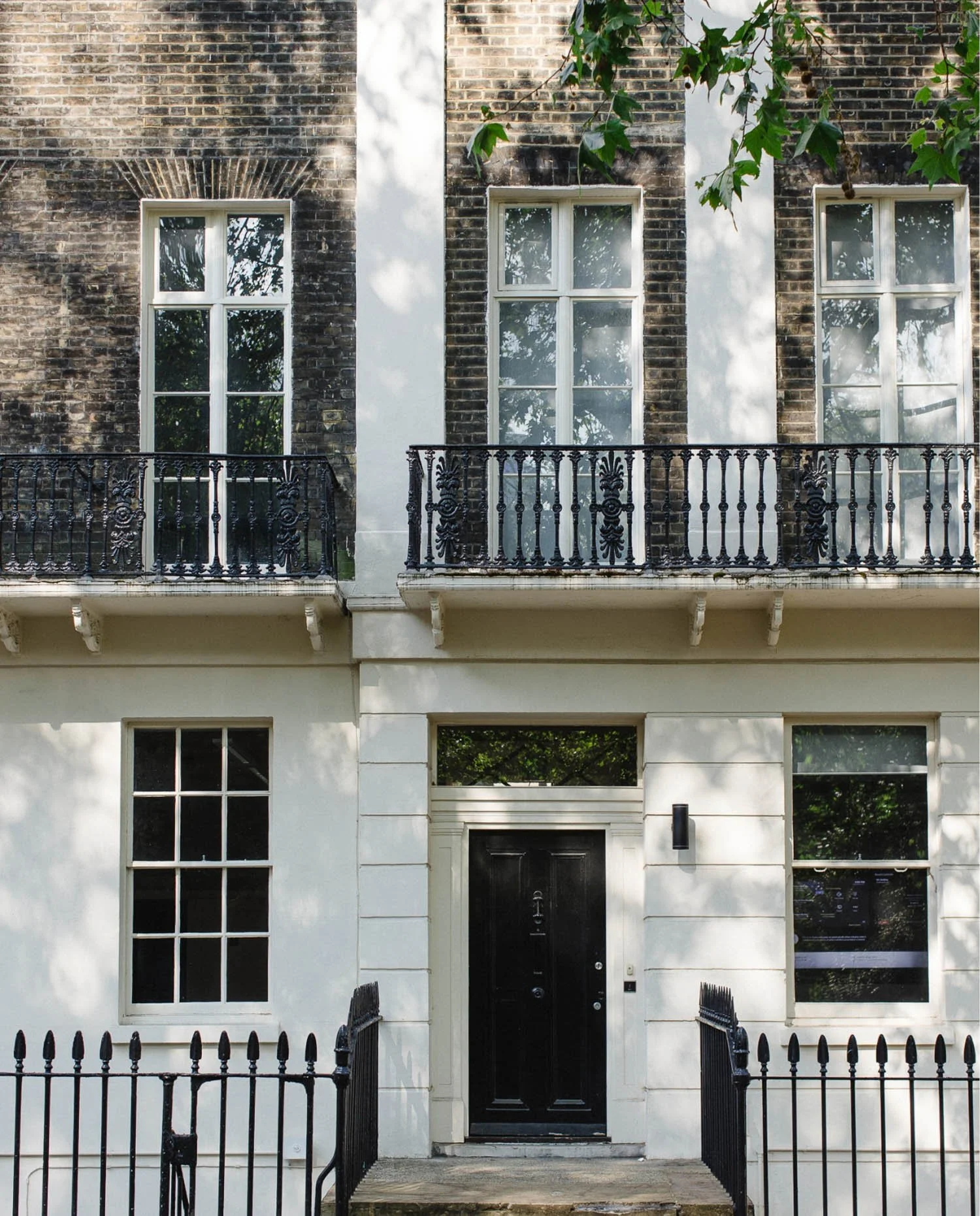
A traditional London brick building
The response to Ben & Elliot’s new accountancy brand was warm and immediate. Georgia, a consultant on the project, captured it perfectly when she wrote to us after the site went live:
The website looks absolutely fantastic - so lovely to see it all come together.
The business cards went down particularly well at networking events. Elliot got back to us to share that the feedback had been "nothing but positive"; that they looked "extremely professional and high end, right on the brief."
Elliot later left this review for us publicly on Google:
Rachael & Simon were absolutely fantastic to work with and we couldn't be happier with the end result. As a small, growing business, it was a difficult decision to change our branding and website, but Wildings were great at every step of the way. Their process allowed them to fully understand our business and wider industry, to create a brand and a website that we can be extremely proud of for years to come. They go above and beyond in every respect and I couldn't recommend them more highly.
What strikes me most about that review is the line, "a brand and a website that we can be extremely proud of for years to come", because it turned out to be true. Less than a year later, Sampson Fielding acquired Bartrum Lerner, a highly respected private client and SME accountancy practice with roots going back to 1988. Ben & Elliot came straight back to us to build the acquisition announcement into the site. When a firm is growing fast enough to acquire another practice, and their first instinct is to call their brand studio, that's the kind of relationship we love.
Elliot was still sharing positive feedback about the website as recently as last year — several years after launch. A brand built to last.
In short: A rebrand that's working doesn't just look better, it opens doors the old brand was quietly closing.
7. By the numbers

The data tells its own story. Comparing the month of launch (June 2023) to May 2026 — nearly three years on:
Website traffic
Active users up 325% per month
Sessions up 239% per month
Organic search (Google Search Console)
Organic search sessions up 975% per month
Google impressions up 159%
Average ranking position improved by 61%, meaning the site now appears significantly higher in search results across all its target keywords
What people are finding them for
The site now ranks and attracts clicks for accountancy and business advice terms that matter; blog posts are generating thousands of impressions; and direct searches for partner names signal a strong referral-led reputation building online.
Top performing pages
The About page is the second most clicked page from Google; a sign that people are arriving curious about the firm and wanting to meet the team. The Careers page has seen an 850% increase in views, reflecting the graduate recruitment ambition we built in from the start.
One caveat worth noting: organic search growth always takes time, and the SEO foundations we laid at launch in 2023 have compounded steadily. The numbers above represent nearly three years of that compounding, which is exactly how good brand and website work should perform.
In short: Organic search traffic up 975% in three years isn't luck, it's what happens when SEO foundations are built properly at launch and given time to compound.
7. What was included
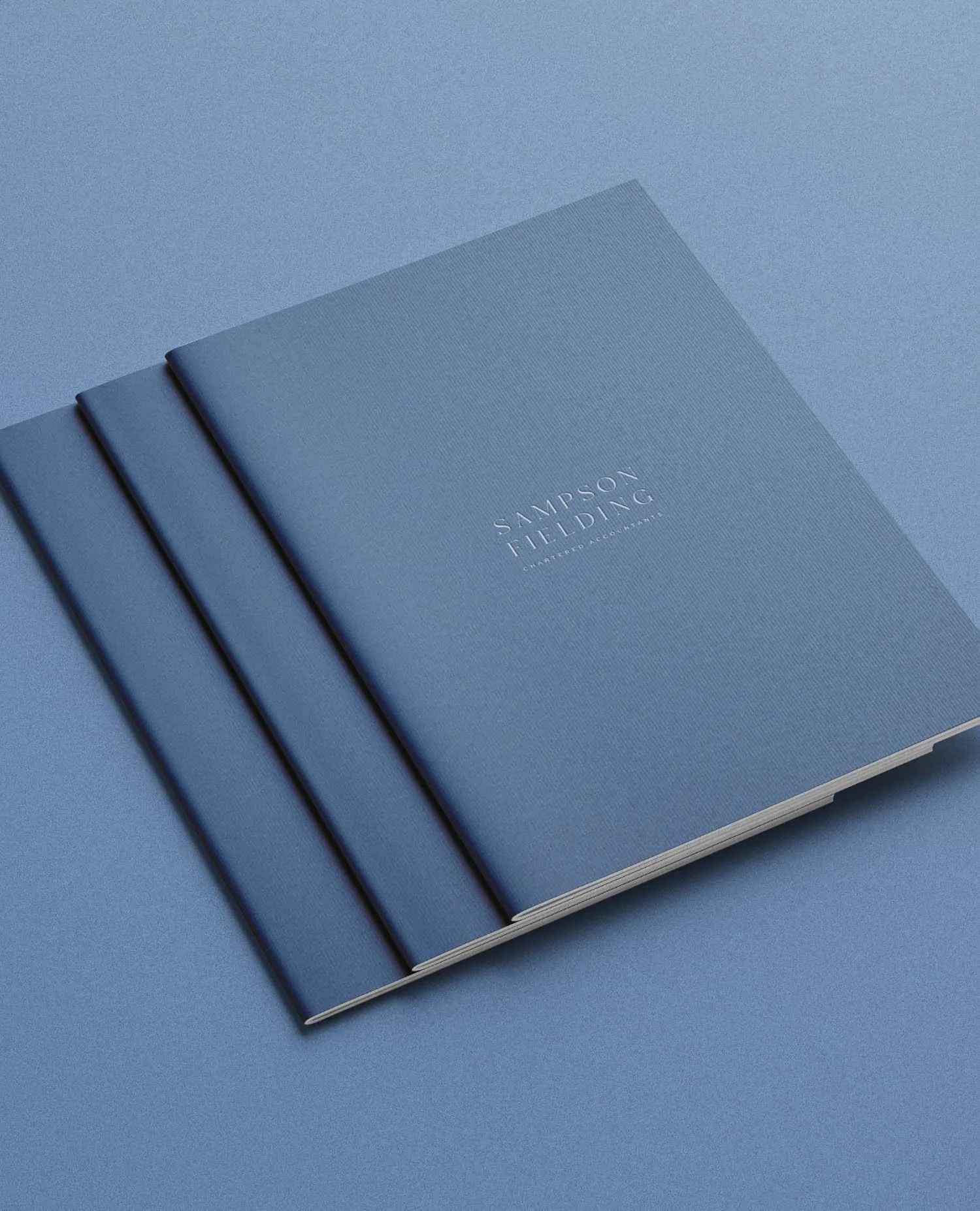
Three navy blue textured notebooks with the Sampson Fielding logo
This project was delivered under our brand strategy, brand identity and website design package:
Full brand strategy: consultation sessions, competitor analysis, audience personas, positioning, brand story framework, content pillars
Complete logo suite (primary, secondary, lockups, submarks, social icons) with full brand guidelines document
Colour palette, typography system, image direction
Website design and build (Squarespace) - Home, Services, About, Careers, Blog, Contact
Brand photography, including at a location house and on location in Mayfair, plus a personal stylist
Enquiry and graduate application forms
Stationery suite: email signatures, letterhead, business cards (GF Smith Colorplan)
Excel / management accounts template
LinkedIn social media graphic templates
Pitch deck template
SEO foundations and DNS setup
Ongoing support: acquisition page, team updates, new service pages
Timeline:
Project agreed November
Strategy begins December
Website live June
Acquisition page the following June
In short: Seeing the full scope of a project in one place is often what helps a prospective client understand why a proper rebrand costs what it costs.
Could this be you?
If your brand was built to get you started but it's no longer doing justice to the business you've actually built (or the one you're building towards), we'd love to hear about it.
We work with ambitious businesses who are ready to show up properly. A brand that opens doors rather than closes them. One that works as hard as you do.
We're currently taking on new projects — get in touch to find out about availability.
Frequently Asked Questions
-
The Sampson Fielding project ran from initial agreement in November 2022 to website launch in June 2023 - approximately seven months end to end, including a full brand strategy process, identity design and Squarespace build. For most professional services firms of a similar size, a realistic timeline for a comparable scope is six to nine months. Rushing the strategy phase to compress that timeline is the single most common reason rebrands underdeliver.
-
In Sampson Fielding's case, yes, measurably. Monthly active users grew by 325% in the three years following the rebrand, organic search sessions increased by 975% and Google impressions more than doubled in the 16 months prior to this case study being written. That said, a rebrand alone doesn't move SEO metrics; it has to be accompanied by proper SEO foundations at build, well-structured page content and a consistent content strategy post-launch.
-
Brand strategy is the process of defining who your business is for, what makes it different and why that difference matters to the people you most want to reach. For professional services firms (accountants, solicitors, consultants) it's particularly important because the visual category is crowded and largely homogeneous. Without a clear strategic position, a new logo is just decoration. With one, every design decision has a reason behind it, and the resulting identity is far more likely to attract the right clients and repel the wrong ones.
Further reading
These sources informed elements of the strategic and creative thinking behind this project and are worth reading if you're considering a rebrand for your own professional services business.
Nielsen Norman Group — How Users Read on the Web
The foundational study on web reading behaviour, which shaped how we structured the Sampson Fielding website. NNG's research showing that users scan rather than read linearly directly informs decisions like the About page layout, the services page hierarchy and the use of clear, specific headings throughoutB Lab UK — Why B Corp Certification Matters for Professional Services
Referenced directly in the Sampson Fielding brand strategy as a differentiation opportunity. Our competitor analysis found only two B Corp Chartered Accountants in the UK at the time, a significant opening for a values-led firm with Sampson Fielding's ambitionsGoogle Search Central — Creating helpful, reliable, people-first content
Google's own guidance on what makes content rank, and what doesn't. The principles here (demonstrating first-hand experience, writing for people not algorithms, citing primary sources) underpin the approach we take to every website and blog we build for clients
About the author:
Simon Cox is the co-founding director (along with his wife, Rachael Cox) at Wildings Studio, a branding, website design and content marketing studio in Torquay, UK. He’s the writer and editor of the Wildings Studio blog which you’re currently reading. Simon is also responsible for the Wildings Studio content marketing services. Simon blogs regularly on topics to do with the core Wildings Studio services on branding, website design and content marketing (blogging). He’s passionate about helping small business develop great content that answers the questions people type in Google in order to get found online (SEO).


About Wildings Studio
Thoughtful, beautiful branding and websites for design-led businesses
Wildings is a website designer for small businesses offering website design. Based in South Devon, UK, we deliver small business website design for design-conscious brands like garden designers, interior designers, architects, circular ethos restaurants, speciality coffee shops, organic cafés and boutique hotels.