Why yellow is the riskiest colour to build a brand around
What does yellow mean in branding?
Yellow in branding signals visibility, optimism, energy and speed. It grabs attention quickly, which is why it’s widely used in advertising, fast food, retail and transport branding. However, yellow can also feel cheap, aggressive or overwhelming if overused. For most businesses, it works best as an accent colour rather than a dominant palette, especially for premium or luxury brands.
In marketing, yellow is often used to create a sense of urgency, youthful energy and high visibility, but successful brands usually balance it with darker or more restrained colours to avoid visual fatigue.
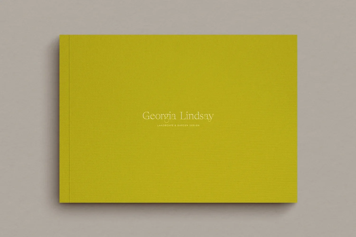
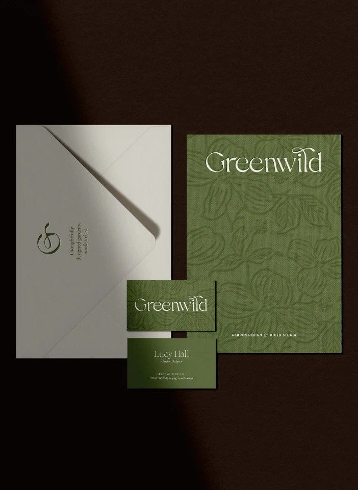
A mockup of a presentation book for Georgia Lindsay garden designer
What does yellow mean in marketing?
In marketing, yellow is used to create visibility, signal emotional energy and be recognised fast. Brands often use yellow because it’s a good way to attract attention quickly, encourage impulse decisions and create a sense of optimism, speed or accessibility. It’s especially common in advertising, retail, fast food and promotional campaigns where standing out and creating an immediate and emotional impact matters.
Why is yellow used in advertising?
Yellow is used in advertising because it attracts attention faster than most colours. Brands use yellow to signal energy, optimism, speed and affordability, particularly in fast food, retail, travel and promotional marketing. Its high visibility makes it effective for signage, advertising and packaging, although too much yellow can feel overwhelming or cheap.
Why yellow is the riskiest colour to build a brand around
Most people associate yellow with a sort of relentless positivity that can feel a bit exhausting. It’s the colour of Post-it notes and smiley faces, after all. However, there’s a darker side to the hue that many designers shy away from discussing. In nature, yellow is a warning; it’s the stripes on a wasp or the belly of a poisonous frog. In the human world, it’s the colour of bile and caution tape. This duality is exactly what makes it so potent for a business. It’s not just "sunny"; it’s a jolt to the system that forces a person to stop and look.
If you’re aiming for a brand that’s quiet and contemplative, yellow is probably going to be a disaster. It’s a loud-hailer of a colour. It works brilliantly for brands like Selfridges, where that iconic yellow bag acts as a walking billboard across London, but it’s a risky move for a luxury spa. You’re playing with fire because yellow is notoriously difficult to pair with other colours without it looking like a hazard sign. It’s about finding that sweet spot where "energetic" doesn't accidentally turn into "annoying".
Why yellow branding is more than just a sunny disposition for your business
Many people associate yellow with relentless positivity that can feel a bit exhausting: it’s the colour of Post-it notes and smiley faces. However, there’s a darker side to the hue that you should be aware of. In nature, yellow is a warning; it’s the stripes on a wasp or the belly of a poisonous frog. In the human world, it’s the colour of bile and hazard markings. This duality is exactly what makes it so potent for a business. Yellow isn’t just sunny; it’s a jolt to the system that forces you to stop and look.
If you’re aiming for a brand that’s quiet and contemplative, be careful with yellow. In it’s brightest form it’s like a loudspeaker; it works brilliantly for brands like Selfridges, where that iconic yellow bag acts as a walking advert across London, but it’s a risky move for a luxury spa. Yellow can be tricky to pair with other colours, which is often why you’ll see it used as a supporting accent colour. It’s about finding that sweet spot where energetic doesn't accidentally turn into annoying.
Top ten takeaway ideas on yellow in branding
Yellow is the colour of raw emotion and feelings, acting as a direct line to the viewer’s ego and self-esteem
Because it has a long wavelength, the human eye has to physically adjust to absorb yellow, creating an immediate psychological reaction
Visibility is its superpower; it’s why the construction industry and health and safety sectors claim it for ruggedness and warning
It’s best used as an accent colour for lifestyle brands to avoid overwhelming the audience with too much "noise"
High contrast is key—pairing yellow with black is the ultimate way to ensure wayfinding or messaging is impossible to miss
Yellow has a shadow side that signals illness, greed or cheapness if the wrong hue is selected
Historical pigments like Indian Yellow or Gambage carry weights of tradition and colonial history that can add depth to a brand story
In the food and hospitality sector, yellow triggers a sense of speed and youthful "live for the moment" energy
Rebellion is a valid brand strategy—yellow was co-opted by the rave culture of the 90s to subvert its innocent "smiley face" origins
Successful branding depends on strategy first; choosing a colour like yellow without knowing your market position is just guesswork
1. Where does the colour yellow come from?
As with many of the colours in this series, yellow can be found in the natural world, but humans have also sought to recreate it where deemed valuable or its extraction laborious. Either of these tended to increase its sense of exclusivity and so greatly drive up its value.
Various hues of yellow have been extracted from the earth or nature since ancient times. The colour yellow can be found variously in the world around us whether from minerals, trees and elements:
Tin lead yellow was produced by mixing lead and tin oxides
Chrome yellow came from the mineral crocoite (for more on crocus and the colour orange, see ‘How to get the best from orange for your branding: bright, vivid & urgent’)
Gambage (a bright hue) was extracted from the Garcinia tree in South East Asia
Orpiment (a canary yellow) derived from natural arsenic sulphides
It would be hard to ignore gold (not to mention rude!), which has been coveted for thousands of year and alchemists have attempted to synthesise it by artificial means since time immemorial.
Yellow has a long and rich history, when plenty of ups and downs, as you can imagine: the orpiment pigment was used in the age of the Ancient Egyptians in their wall art, whereas Imperial yellow was reserved solely for the ruling class in Imperial China for a thousand years.
The discovery of yellow as a colour in itself is similar to many other colours in this series: humans beings observed it - became notable (often highly desired) for a particular quality - then extracted and later manufactured. Moreover, in modern times you’ll often see it reinvented or perhaps twisted far beyond its initial incarnation!
“Yellow leads a roving , versatile life”
In short: Yellow has a long material history rooted in both natural pigments and synthetic innovation, which has shaped its cultural associations with rarity, power and visibility.
2. What does the colour yellow symbolise?
The colour yellow is closely associated with light, visibility and emotional intensity. In psychology, it’s linked to optimism, confidence, creativity and extroversion because it naturally catches the eye and stimulates attention. Across branding, art and culture, yellow has historically symbolised everything from joy and prosperity to warning, illness and excess, depending on the context in which it appears.
What emotions does yellow represent?
Yellow is strongly connected with emotional energy. It’s often associated with happiness, warmth, enthusiasm and spontaneity because of its relationship to sunlight and brightness. In branding and advertising, yellow can create feelings of optimism, youthful energy and momentum, which is why it’s frequently used by fast-moving consumer goods (FMCG) brands.
At the same time, yellow can also heighten the state of emotions. Bright or highly saturated yellows may create feelings of urgency, restlessness or overstimulation when overused. This duality is what makes yellow such a powerful, but potentially risky, colour in branding.
Is yellow a positive or negative colour?
Yellow can carry both positive and negative meanings depending on the shade, context and cultural associations surrounding it. On the positive side, yellow symbolises creativity, confidence, energy, optimism and visibility. Historically, gold and rich yellow pigments have also represented prosperity, divinity and status.
However, yellow also has a shadow side. In some contexts it can suggest caution, hazard, greed, illness or a cheap bargain. Bright yellow is commonly used in warning signs and hazard markings because it demands attention so effectively. In branding, this means yellow can either feel joyful and energetic or overwhelming and abrasive if handled poorly.
In short: Yellow symbolises high-energy emotional extremes, swinging from positive traits like optimism, confidence, and warmth to negative associations like caution, illness, and cheapness depending on its context.

A mockup of a business card for Georgia Lindsay garden designer

A mockup of a social media post for Georgia Lindsay garden designer
3. How do businesses use the colour yellow in branding?
Businesses use yellow in branding because it attracts attention quickly and creates an immediate emotional response. Its brightness and high visibility make it especially effective for brands that want to appear energetic, accessible, youthful or fast-moving. Because yellow catches attention so strongly, it’s often chosen as an accent colour rather than the foundation of an entire visual identity.
Well-known brands that use yellow (and why)
Many of the most recognisable global brands use yellow because it increases visibility, improves instant recognition and communicates speed, accessibility and emotional energy. In most cases, yellow is not used as decoration — it is doing strategic brand work in signalling urgency, affordability or high-impact visibility.
| Brand | Sector | What yellow signals in their branding |
|---|---|---|
| McDonald’s | Fast food | Speed, affordability, instant gratification and global recognition |
| Subway | Fast food / retail food | Freshness, accessibility and a lighter, more flexible food experience |
| DHL | Logistics / delivery | Speed, urgency and high-visibility reliability in transit |
| IKEA | Retail / furniture | Affordability, simplicity and mass accessibility |
| Snapchat | Social media | Youthfulness, spontaneity and ephemeral communication |
| Post-it | Office supplies | Utility, visibility and everyday creativity |
| Shell | Energy | Heritage, visibility and established global trust |
| National Geographic | Media / publishing | Curiosity, exploration and visual storytelling |
Why these brands use yellow
Yellow works across such different sectors because it performs three consistent roles:
Maximum visibility — it stands out instantly in crowded visual environments
Fast emotional recognition — it signals energy, optimism and immediacy
Perceived accessibility — it lowers the barrier to entry, making brands feel more approachable and less elite
In most of these examples, yellow is doing strategic work rather than aesthetic work — it is designed to be seen first, understood instantly, and remembered later.
In short: The most successful yellow brands use it not for decoration, but for instant recognition, emotional speed and maximum visibility in crowded markets.
Why do so many brands use yellow?
Brands use yellow because it is one of the most visible and stimulating colours psychologically. Yellow naturally catches the eye faster than many other colours, making it highly effective for advertising, packaging, signage and logos in crowded environments (which is why you see it in airports).
Yellow is also memorable. Brands that use yellow well often stand out more easily in the minds of consumers because the colour creates a strong visual impact. This is one reason yellow appears so frequently in fast food, retail, delivery and travel branding where instant recognition matters.
Emotionally, yellow communicates youthful energy, optimism and momentum. It can make a brand feel more approachable, spontaneous and energetic, which is particularly valuable for business-to-consumer companies targeting broad audiences.
Many businesses also use yellow to suggest speed and accessibility. In branding and advertising, yellow often signals convenience, affordability and quick decision-making, helping brands feel immediate and easy to engage with.
Yellow brands in the construction industry
The colour yellow is used prominently by construction brands JCB, Caterpillar and Stanley, which between them cover heavy plant machinery, construction tools and clothing and workwear.
In this context, visibility is important, so the colour yellow is used to ensure products stand out from a safety point of view. As such the brands themselves then derive a sense of safety, strength and rugged dependability from the association with yellow.
The use of yellow in health & safety
The colour yellow has long been associated with important information, warnings and safety. Under UK regulation, warning safety signs are required to be yellow, indicating a specific danger that may be present within a workplace.
Another reason for choosing yellow is because it is an inherently bright colour, and so when paired with black, creates a high-contrast colour combination. This is ideal when it is important to convey an important message or draw people’s attention to information they need to know or adhere to.
As such, yellow and black is the archetypal combination found in airports where safety is key, but also providing highly visible guidance (called wayfinding: the user experience of orientation and navigation in the man-man environment) for people who need to get to particular areas within a busy, sprawling complex.
The reality of yellow in branding
The reality of the colour yellow is that it is very bright and so can overwhelm business branding when it is the main element. This is why exclusively yellow brands tend to be relatively few, although the ones that are, tend to stand out in the mind (such as McDonalds, SnapChat, Post-It, Tour de France).
This is why yellow tends to be used as an accent colour within a wider brand palette. It doesn’t dominate or overwhelm, but brings eye-catching flashes and a sense of joy and brightness that can sit more happily alongside other values that are being communicated.
In short: Businesses use yellow to create visibility, emotional energy and fast recognition, making it especially effective for brands that rely on attention and speed.
4. Which industries use yellow most effectively in branding?
When you see yellow in a company’s branding or advertising its likely there for a reason and well worth pausing to ask yourself why that might be.
We’ve pulled together a couple of categories below of businesses with yellow brands or branding to help illustrate what yellow means when companies or businesses use in their branding or advertising. These comprise of snack food, fast food, travel and delivery brands.
1. Yellow in snack food and fast food branding
Fast Moving Consumer Goods (FMCG) is the euphemistic label the industry gives to snack or junk food, and the colour yellow often features in their branding. In the food context yellow is a good choice in branding as it hints at a joyful, pleasant but speedy experience. The youthful feel of yellow is also suitable in this category, as snack food brands want to attract and appeal to a younger audience.
A few well known brands that use yellow are:
Pringles (crisps (UK), potato chips (US))
Chupa Chups (sweets (UK), candy (US))
Maggi (packeted instant noodles)
Related to the snack brands are fast food restaurants, and yellow is again used to mean similar things in their branding and advertising. In short, yellow is fast food brands’ way of saying, ‘we want you to experience a fun, uplifting and happy time with us’. Live for the moment and enjoy the experience! Yellow is not only eye-catching but also indicates the exciting and rejuvenating experience that lies within: not just through the food, but the wider journey of visiting and being in the surroundings of the brand itself.
Well-known fast food brands using yellow include:
McDonalds
Subway (note how it has introduced green to emphasis its more healthy attributes)
2. Yellow in travel and delivery branding
Travel and delivery brands use yellow in their branding and advertising in a fairly obvious and straight-forward way. Consumers desire a quick and painless experience, so the yellow in branding brands have employed the colour yellow to underline what kind of experience customers will get with them: pizzazz, lots of energy and, of course, speed.
Travel and delivery brands are among a small pool of companies other snack and fast foods to use yellow. Interestingly they often temper the brightness of yellow or use it as a complementary accent colour. This approach brings more depth and sophistication to the overall impact or is a way to add chutzpah to perhaps a more conservative palette.
Well-known travel and delivery brands using yellow include:
DHL & UPS (delivery and courier services)
Hertz (vehicle hire)
Goodyear & Pirelli (tyre manufacturers)
Why do fast food brands use yellow?
Fast food brands use yellow because it creates a sense of speed, energy and instant gratification. Psychologically, yellow is stimulating and attention-grabbing, which makes it highly effective for businesses competing for consumers making quick decisions in busy environments such as high streets, motorway service stations and shopping centres.
Yellow also carries a youthful and optimistic quality that helps fast food brands feel approachable, fun and accessible. Combined with warm colours such as red or orange, it can heighten feelings of excitement, appetite and urgency, encouraging customers to make fast, impulse-driven choices.
Another reason yellow appears so often in fast food branding is visibility. Bright yellow signage and packaging are easy to recognise from a distance, helping brands stand out in crowded commercial environments. This is especially important for global chains that rely heavily on instant brand recognition and consistency across locations.
In short: Fast food, FMCG and logistics industries use yellow most effectively because it acts as a visual shorthand for speed, accessibility and frictionless impulse choices.
Master colour in your branding
If you are a design-conscious brand—perhaps a garden designer, architect or interior stylist—understanding how colour impacts your reputation is vital. You can explore our deep dive into how to use colour psychology in business branding to see how these principles apply across the board.
If you’re ready to define a visual identity that truly resonates with your ideal clients, our branding service is designed to help you build a brand with both soul and strategy.
Want to discuss your brand’s choice of colour? Get in touch to start a conversation
5. How have businesses used yellow creatively in their branding?
While yellow is often associated with optimism and friendliness, some brands use it in more unexpected ways to create tension, edge or cultural relevance. Because of yellow’s proximity to ideas of visibility, warning and emotional intensity, it can easily shift from feeling playful and upbeat to provocative or rebellious depending on how it’s styled and the context.
Creative brands often lever this ambiguity: rather than using yellow purely to appear cheerful, they use it to feel disruptive, high-energy or slightly confrontational. This approach works particularly well for brands that want to stand apart from safer, more restrained competitors.
Can yellow feel rebellious or subversive?
Yes, yellow can absolutely feel rebellious or subversive when used intentionally. Although it’s commonly linked to sunshine, smiley faces and positivity, yellow also has strong associations with warning signs, hazard tape, chemicals and visual disruption. This gives the colour a natural tension that certain brands and cultural movements have used to their advantage.
One of the clearest examples is 1990s rave culture, in which fluorescent yellow became associated with rebellion, nightlife and euphoric escapism. The iconic yellow smiley face, originally designed as a harmless symbol of happiness, was adopted and transformed by club culture into something more chaotic, energetic and anti-establishment. Saturated yellow graphics, acid-house posters and high-visibility styling became visual shorthand for freedom, excess and emotional intensity.
Modern brands sometimes tap into this same energy. Using sharp yellows, industrial contrasts or neon tones can make a brand feel disruptive, youthful or culturally charged rather than calm and polished. In creative industries especially, yellow can signal confidence, experimentation and a willingness to challenge convention.
However, this approach requires careful handling: push yellow too far and a brand can start to feel abrasive, chaotic or visually exhausting. The most successful brands using rebellious yellow tend to pair it with strong typography, restrained layouts or darker supporting colours that give the energy structure and clarity.
In short: Creative brands subvert yellow’s friendly reputation by pairing it with heavy industrial or neon tones to channel an anti-establishment sense of rebellion and disruption.
6. What are the risks of using yellow as a primary brand colour?
The biggest risk of using yellow as a primary brand colour is that it can quickly become visually overwhelming. While yellow creates visibility and energy, overuse can make a brand feel cheap, aggressive, immature or difficult to trust. This is why many premium and luxury brands use yellow sparingly rather than building an entire identity around it.
One of yellow’s greatest strengths is also its biggest weakness: intensity. Because yellow reflects light strongly and immediately attracts attention, large amounts of bright yellow can create visual fatigue over time. Instead of feeling uplifting or energetic, a heavily yellow brand identity may begin to feel noisy, tiring or emotionally overstimulating, especially across websites, packaging or interiors where people spend longer periods engaging with the brand.
Yellow also carries strong cultural associations with warnings, hazards and caution. Black-and-yellow combinations are widely used in safety signage, construction environments and industrial design because they are so visible. While this can help a brand feel bold and impossible to ignore, it can also unintentionally create feelings of danger, urgency or low-cost practicality rather than refinement or trust.
Another challenge is that yellow can be difficult to pair harmoniously with other colours. Certain shades become harsh when combined with high-contrast palettes, while softer yellows can quickly lose clarity or feel dated. This is one reason many brands use yellow as a supporting accent rather than the dominant colour within a broader visual identity.
Accessibility and readability can also become problematic. Light yellows often struggle with contrast on white backgrounds, making digital elements (like text, buttons or interface designs) harder to read. Stronger yellows improve visibility but may feel abrasive when used too aggressively. As such, successful yellow branding requires careful consideration of tone, typography and supporting colours.
Perhaps the biggest limitation is that yellow rarely communicates calmness, exclusivity or understated luxury on its own. Brands positioned around elegance, craftsmanship, wellness or quiet sophistication often find that too much yellow undermines the emotional ambiance they are trying to create. This doesn’t mean yellow cannot work for premium brands, but it usually performs better when balanced with darker, earthier or more restrained tones.
Ultimately, yellow is a high-impact colour that rewards precision and restraint. Used strategically, it can make a brand feel energetic, memorable and emotionally engaging. Used without enough balance, it can quickly tip into visual chaos or feel less premium than intended.
In short: The main risk of yellow is visual overload, which can reduce trust and perceived quality by making a brand feel chaotic, cheap or overstimulating.
6. Is yellow a good colour for small business branding?
Whether yellow is a good choice for your small business branding depends entirely on your type of business, audience and how you want to position yourself. Yellow can be extremely effective for creating visibility, personality and memorability, but it needs careful handling to avoid feeling overwhelming or misaligned with where your brand sits in the market. For many small businesses, it works best as a supporting colour rather than the dominant foundation of their brand identity.
When does yellow work best in branding?
Yellow works best in branding when a business wants to communicate energy, optimism and approachability. It is particularly effective for brands that rely on fast recognition, quick decision-making or high levels of customer engagement, such as food, retail, hospitality, delivery services and creative industries.
It also performs well when used as an accent rather than a primary colour: yellow can highlight key touchpoints like calls-to-action, packaging details or visual cues, adding vibrancy without overwhelming the overall branding. This allows a brand to feel dynamic and memorable while still maintaining balance and control.
For small businesses targeting younger, broad or lifestyle-led audiences, yellow can help create an immediate sense of friendliness and accessibility. However, for brands aiming to position themselves as highly luxurious, calm or understated, yellow is often more effective when used sparingly or combined with deeper, more grounded tones.
Ultimately, yellow works best when it is used carefully and intentionally. Small businesses that understand how to balance its intensity using structure, contrast and restraint can utilise yellow to create a brand that stands out confidently without compromising clarity or its perceived quality.
Independent brands using yellow
Yellow is an emotive colour and plenty of independent brands have used yellow in their branding. Here’s three of our favourite independent brands who use yellow really well:
Glebe House Devon is a guest house in Devon, cherishing local produce, craftsmanship and seasonal rhytms
Glass Shed Studio is a Devon maker, repurposing textiles and fabrics - we love the yellow detailing in its branding and how it’s local to us in the wonderful market town of Totnes
Bloom & Wild is the original letterbox flower delivery company, delivering beautiful flowers by post
In short: Yellow can be highly effective for small businesses seeking visibility and personality, but it works best when used as an accent rather than a dominant brand colour.
Final thoughts on yellow for businesses and in branding
If you got this far, what is yellow for you: sunny and bright or sinful and sensationalist? Is it in the running as a colour for your brand? It really depends on how you want to connect with your audience. If you want to evoke positivity, creativity or energy, yellow has the power to do all that. As we’ve said time and again, like any colour, it’s important to consider how it fits with your brand’s message and values.
If you're unsure how to incorporate yellow - or any colour - into your branding, we’re here to help. From start-up businesses to established brands, we work with design-conscious businesses to create identities that stand out and resonate with your audience.
Explore the rest of our colour in branding & colour psychology series, or follow us on Instagram for more tips and inspiration.
Frequently Asked Questions
-
Yellow can be an excellent choice for design-led brands, but it requires a sophisticated touch. Instead of primary, fast-food yellows, architects and interior designers often opt for muted ochres, deep gold or Indian yellow hues. These shades convey warmth, creativity and a sense of established history without the aggressive urgency of brighter tones.
-
In hospitality, colour is a sensory cue. Yellow is known to stimulate the appetite and create a sense of movement and cheerfulness. For a circular-ethos restaurant or a speciality coffee shop, using yellow accents can make a space feel more social and energetic, encouraging a positive, in-the-moment customer experience.
-
The main risk is visual fatigue; yellow is the most fatiguing colour for the eye to process due to the high amount of light it reflects. Overuse can lead to feelings of anxiety or frustration in your audience. It’s often safer and more effective to use yellow as a secondary or accent colour to highlight key call-to-actions or brand elements.
More insights on colour psychology and branding for creative businesses:
Article name as bullets linked to post
This series is inspired by Kassia St Clair’s excellent book, ‘The Secret Lives of Colour’. (The beautiful, sought-after hardback version is well worth getting hold of!). The best place to buy ‘The Secret Lives of Colour’ is direct from the publisher. Please support your local independent bookseller and avoid Amazon if possible. Amazon is not a force for good in the world of books and small business: Way past its prime: how did Amazon get so rubbish?
About the author:
Simon Cox is the co-founding director (along with his wife, Rachael Cox) at Wildings Studio, a branding, website design and content marketing studio in Torquay, UK. He’s the writer and editor of the Wildings Studio blog which you’re currently reading. Simon is also responsible for the Wildings Studio content marketing services. Simon blogs regularly on topics to do with the core Wildings Studio services on branding, website design and content marketing (blogging). He’s passionate about helping small business develop great content that answers the questions people type in Google in order to get found online (SEO).

In this article:
Why yellow branding is more than just a sunny disposition for your business
Top ten takeaway ideas on yellow in branding
Free brand colour strategy guide
What does yellow mean in a company’s branding or advertising?
How have businesses used yellow creatively in their branding?
About Wildings Studio
Thoughtful, beautiful branding and websites for design-led businesses
Wildings is a website designer for small business offering website design. Based in South Devon, UK, we deliver small business website design for design-conscious brands like garden designers, interior designers, architects, circular ethos restaurants, speciality coffee shops, organic cafés and boutique hotels.