How to get the best from orange for your branding
Orange branding conveys a powerful sense of confidence, energy and vibrancy that helps small businesses stand out in crowded markets. By understanding the psychology of orange, from its origins in citrus and saffron to its use by luxury houses like Hermès, you can harness its visibility to create a brand that feels both bold and approachable.
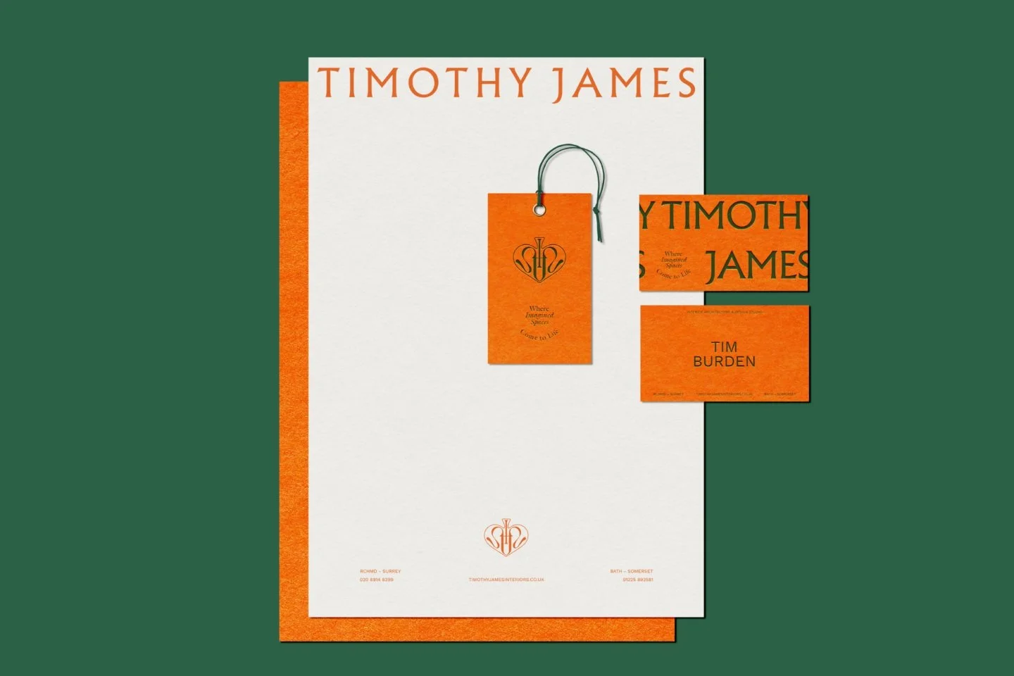
Orange and white stationery set for Timothy James Interiors
How to use the psychology of orange to build a confident brand identity
If you want one word for the impact of orange in branding for small businesses, we would suggest ‘confidence’. This makes sense when you consider how orange comes across: bright, vivid and vibrant. And brands have picked up and made use of these qualities for centuries since the fruit appeared from trade routes from the Far East.
If you like the sense of fun and urgency you get with orange in branding, be careful before rushing headlong to your brand designer. Colour needs to be treated carefully and wisely, and orange is no different.
Although used by luxury, high-end brands, it also has links with no-frills, budget brands, depending on how you employ it.
Read on as we dig into the colour orange and explore how you can use it in the best way for your business brand.
“Orange is like a man, convinced of his own powers.”
Essential takeaways for using orange in your branding or brand strategy
Orange conveys confidence, energy and vibrancy in branding
Its visibility makes it ideal for contexts where cut-through and recognition are key
Orange attracts attention, creating urgency and visual impact when paired with contrasting colours
The colour was traditionally sourced from fruit to pigments like saffron, amber, ginger and minium
Use orange carefully, as it can feel both luxury or budget, depending on its application
Consider darker shades of orange for a more sophisticated, grown-up feel
Use orange as an accent to inject playfulness without overpowering a mature brand
Be mindful of unintended associations or orange and balance its fun and boldness with how you want to position your brand
Think inclusively when naming or using orange tones, avoiding assumptions about skin colour with shades like ‘nude’
Study how other brands successfully use orange and avoid pitfalls to inspire your own applications without copying
1. Where does the colour orange come from?
The colour orange unsurprisingly comes from the citrus fruit of the same name which most likely originated in China. As the fruit steadily spread west via trade routes such as the Silk Road it left is mark on languages along the way.
There are a number of sources of orange as a pigment, depending on the particular hue in question:
Saffron (yellow-orange) is harvested from the crocus flower, Crocus sativus
Amber (honey-ember) is from fossilised tree resin
Ginger (auburn) is extracted from the Zingiber rhizome and gives us the familiar household spice
Minium (bright orange-red) can be found in natural deposits (lead tetroxide) or manufactured like the pigment lead white
Depending on the pigment, the extraction process can be easier or harder, giving varying costs, but the impact of orange remains the same, which we explore below.
Key points:
The name and colour orange originate from citrus fruits moving west via the Silk Road
Natural orange pigments are derived from diverse sources including crocus flowers, tree resin and lead deposits
The extraction difficulty of different pigments historically influenced the cost and prestige of the colour orange
2. How is the colour orange used in practice?
Because of orange’s brilliant vividness, it has a knack for conveying a sense of urgency and potential danger. This is particularly so because it can set up striking contrasts when paired with other colours.
Interestingly, it sits on the opposite side of the Colour Wheel to blue (we covered the psychology of blue earlier in the series), which typically conveys security, order and dependability; quite the opposite to the feelings orange evokes!
Orange’s characteristic sense of urgency and danger means it is commonly used in warnings, signage and alerts (a few are listed below). For traffic contexts, it is especially useful in bad weather or low light because of the high contrast it creates with dark colours.
Prison suits (common in the US rather than the UK)
Toxic chemicals (such as Agent Orange in the Vietnam War)
Terror threat levels (e.g., US Homeland Security Advisory System)
Traffic signage (common to the US rather than UK where it is confined to emergency telephones)
Warning symbols on roads (again, more the US)
Aircraft black box flight recorders
Examples of brands that have used orange include:
The House of Orange, which became modern day Netherlands, notable for its national football team
Protestants in Northern Ireland, who conduct protest marches are known as Orangemen
The Golden Gate Bridge in San Francisco (from which we get the official colour ‘Golden Gate Bridge International Orange’)
Hermès (luxury fashion)
Easyjet (budget airline)
Key points:
Orange sits opposite blue on the colour wheel, offering a high-contrast alternative to stability and order
Orange’s natural vividness makes it the global standard for safety signage, flight recorders and alerts
Iconic entities, ranging from the Dutch Royal Family to the Golden Gate Bridge, use orange for its distinctness

Timothy James Interiors logo in orange with a decorative crest
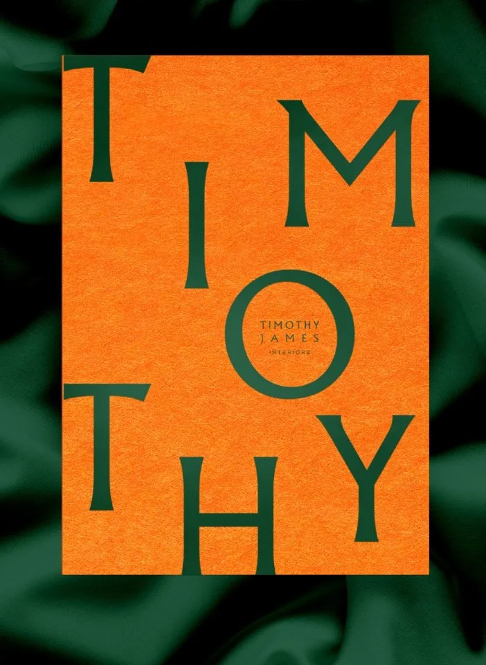
A textured orange card for Timothy James interior design
3. How can a small business use the colour orange in its branding?
Orange is an exciting brand colour and brands have used it accordingly, which we’ll explore below.
Because of its eye-catching nature, orange has associations with boastfulness and arrogance. The advertising industry has capitalised on its natural visibility, dialling up its visual impact to the maximum possible level through neon signs - perhaps the loudest and brashest way to publicise products and services.
The brilliantly vivid nature of orange has also been capitalised on in print. Medieval manuscript illustrators used the orange-red pigment minium to highlight capitals, headings and paragraph markings in order to help them leap off the page in the eye of the reader. (N.B. This is the origin of the word ‘miniature’ - from the shade of orange, rather than to do with size or scale!)
If we turn back to ginger briefly, the natural characteristics of the spice have naturally carried over into wider associations. Ginger’s hot, pungent and exotic qualities that all compel attention have led it to be linked with redheads, often stereotyped for their fiery temper.
As you can tell from practical uses of orange above, it lends itself to context and markets where visibility and cut-through are important. On a brand level, business that want to pick up on the sense of danger or urgency, could well consider orange as an option.
Key points:
Medieval illustrators used orange pigments to make text leap off the page, a tactic that modern brands can use to cut-through
The colour orange often carries ginger characteristics—hot, pungent and exotic—to compel immediate attention
Orange is a strategic choice for businesses that want to project a bold, loud or an adventurous personality
4. Dangers of orange in your branding
As with many colours, orange can serve a variety of brands that have different aims. The challenge is to avoid unintended associations that ultimately undermine or damage your brand.
On the one hand, orange has been employed by high-end, luxury brands, such as the French fashion house, Hermès - achingly elegant and exclusive. There’s also motorcycle brand Harley Davidson, which, despite being in a very different sector, sits at the very top of its industry, offering highly-sought after motorcycles with an enviable cult following.
In contrast, orange has also picked up associations with the budget, no-frills end of the market. This is perhaps inevitable, because of its bright, fun, breezy feel, synonymous with summer holidays. As such, lower-end, mass-market brands have gravitated to it, such as Easyjet, B&Q (cf. Home Depot in the US), Fanta, Flymo and Amazon.
The key here for small businesses considering their branding is first to gain a deep understanding of their audiences and then analyse how they can appeal to customers while standing out from competitors. A brand strategist and designer will then be able to navigate how a business can draw on powerful and suitable elements of a colour, pairing them with a wider set of design elements, so that as a whole they get the right results.
One practical tip when considering orange is to explore its darker shades, which give it it a more grown-up feel. Alternatively, if you want to inject an element of fun and playfulness into a maturer brand, using orange as a supporting accent colour is a good option.
Key points:
Orange can inadvertently signal a budget or discount brand if the tone and context aren't carefully managed
High-end brands like Hermès prove that orange can be elegant when paired with the right materials and minimalist design
Testing orange as a supporting accent colour is a safe way to inject life into a brand without overwhelming your audience
Mastering colour psychology for your brand
If you are curious about how these shades impact your business identity, our pillar page on how to use colour psychology in business branding is a great place to start. We help design-conscious brands—from interior designers and architects to garden specialists—move beyond pretty visuals to understand the deep psychological impact of their brand palette.
Our branding service is designed to help you refine your message and align your visuals with your true business values. If you are ready to find your footing with a palette that feels settled and intentional, enquire via our contact page to start a conversation.
5. A short epilogue for the colour orange
Did you know that nude is a shade of orange? Shade refers to the pure pigment of orange, but with some black added, so the colour remains the same, only darker. In the case of nude, it is a very pale shade.
The question then is : ’nude, but for whom?’ What if I have dark skin?
The problem with nude as a shade of orange is that it assumes a pale skin colour, i.e., Caucasian, and this is simply not representative of many skin colours around the world or in a diverse society or target audience of a brand.
Despite there being many other alternative names for nude (such as sand, peach or beige), nude has proved obstinate in usage.
The lesson here is that our choices, especially as brands, can have consequences, so if your brand values include inclusivity, think carefully about using nude as a label or product description within your branding.
It might only be a label, but think of nude (orange) within your wider branding architecture and what it can or how it could potentially damage your brand.
Key points:
Technical shades of orange, such as nude, need to be handle sensitively because of their associations with inclusivity
Many traditional colour names for pink assume a Caucasian perspective which can alienate a diverse audience
Choosing more descriptive names like sand, peach or amber can help a brand feel more welcoming and modern
6. Examples of brands using the colour orange
There are lots of brands using orange - here are three brands using orange quite differently to draw out their various qualities! Mandarin Stone are one of the largest suppliers of natural stone tiles, marble, limestone and flooring, as well as stone bathware in the UK. Cubitts is a spectacle company that creates handcrafted frames in the UK. They offer bespoke, made-to-measure glasses. AKT is a gender-neutral, aluminium-free deodorant balm that is made in the UK and tried, tested and approved by London’s West End performers.
Key points:
Mandarin Stone uses the colour to link to natural materials and high-quality flooring
Cubitts demonstrates how orange can feel artisanal and bespoke in the eyewear industry
AKT shows that orange works perfectly for gender-neutral, high-performance lifestyle products
Anything else I need to know?
If had written off orange as a budget colour or unsure how it can give your high-end brand an edge, we hope this has helped give you a new perspective on it for your small business. Watch out for upcoming instalments on colour psychology and how it feeds into your branding or browse previous articles below.
Frequently Asked Questions
-
While orange is often associated with budget brands like EasyJet, it can be incredibly sophisticated. Luxury houses like Hermès use a specific, vibrant orange to signify exclusivity and craft. The key is to pair it with high-quality textures, ample white space and a refined secondary palette to avoid the discount look.
-
For a bold, high-energy look, orange pairs brilliantly with its complement, blue. If you want something more grounded and earthy—perfect for interior designers or architects—try pairing orange with deep forest greens, slate greys or warm wood tones. These combinations soften the vibrance of orange while maintaining its warmth.
-
Orange has a long history of use in safety equipment and maritime alerts because of its high visibility in low-light conditions. Psychologically, it demands a physical response, making it an excellent choice for Call to Action buttons or highlights where you want a customer to take immediate notice.
Explore more insights on colour and branding:
This series is inspired by Kassia St Clair’s excellent book, ‘The Secret Lives of Colour’. (The beautiful, sought-after hardback version is well worth getting hold of!). The best place to buy ‘The Secret Lives of Colour’ is direct from the publisher. Please support your local independent bookseller and avoid Amazon if possible. Amazon is not a force for good in the world of books and small business: Way past its prime: how did Amazon get so rubbish?
About the author:
Simon Cox is the co-founding director (along with his wife, Rachael Cox) at Wildings Studio, a branding, website design and content marketing studio in Torquay, UK. He’s the writer and editor of the Wildings Studio blog which you’re currently reading. Simon is also responsible for the Wildings Studio content marketing services. Simon blogs regularly on topics to do with the core Wildings Studio services on branding, website design and content marketing (blogging). He’s passionate about helping small business develop great content that answers the questions people type in Google in order to get found online (SEO).

About Wildings Studio
Thoughtful, beautiful branding and websites for design-led businesses
Wildings is a website designer for small business offering website design. Based in South Devon, UK, we deliver small business website design for design-conscious brands like garden designers, interior designers, architects, circular ethos restaurants, speciality coffee shops, organic cafés and boutique hotels.