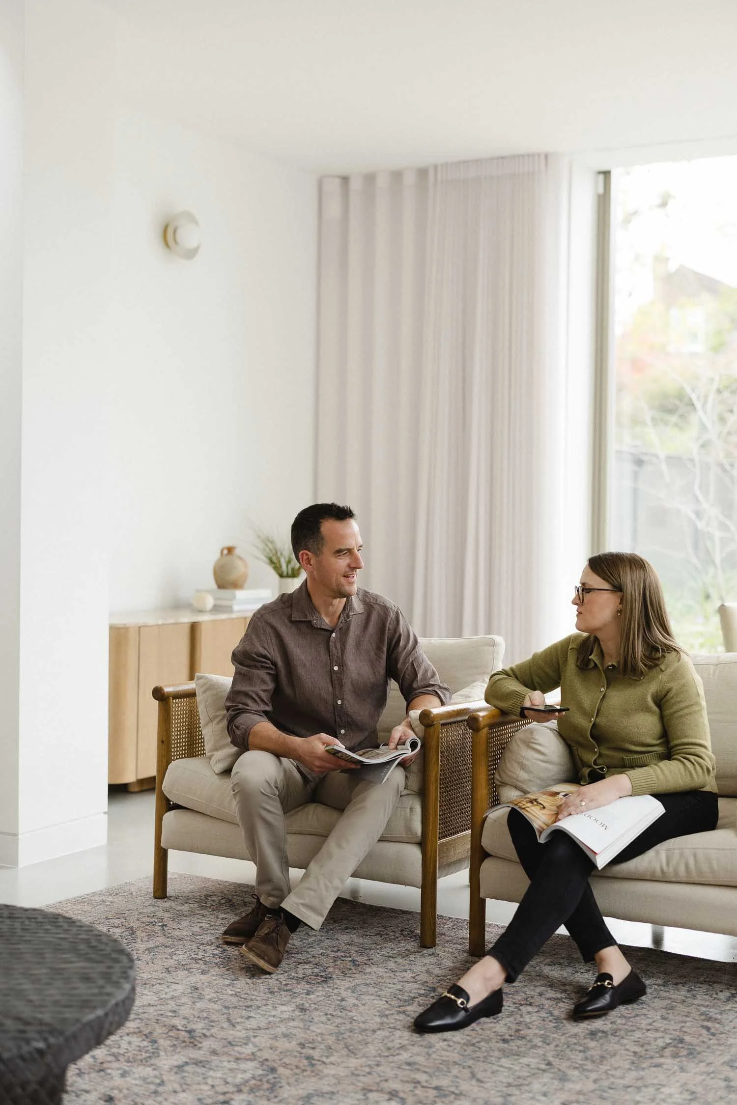
Essential website questions business owners ask first (2026)
What makes a great website? A big and essential question that you should be asking as a small business owner. From boosting your organic search traffic to making your site feel more polished, trustworthy and user-friendly, there’s no shortage of moving parts when it comes to building a website that actually works for your business.

This article is part of our ongoing Q&A series where we answer your most pressing website and content questions. Each week, we unpack a range questions on topics all relating to websites for small businesses — from SEO and design decisions to tech tips and content strategy — to help you get more from your website and attract more of the right visitors.
Let’s dive in and don’t forget to check back for further questions in subsequent weeks — we’ll be keeping this updated as a rolling blog.
1. Questions on AI search, generative AI & your website
-
Yes, it's drastically changing - what we're finding is that people use ChatGPT as a search engine in its own right, instead of, say, Google.
Instead of having to put in some keywords, refine them, potentially get frustrated when they produce the wrong results, people can put in their question in a really conversational way and the AI chat bot understands the context behind it.
This makes it much easier to undertake a search because the AI chat bot understands who you are, where you are and what you're looking for from previous searches.
Whereas before someone may have been looking for answers to things, now users want the AI chat bot to help specifically with shaping the question and discovering new things about the topic.
It’s like using AI searches like a Virtual Assistance almost, in a much more two-way fashion.
A user may already have given the AI chat bot quite a lot of prompts already to tell it about their preferences. When they ask a question they can be much more nuanced in the way they put forward the terms of the things or the type of answers they’re looking for; also the way in which they want the AI chat bot to synthesise the details into an end result.
-
The AI overview works through machine learning, so AI chat bots crawl the whole internet, look at all the websites, and then they put together a curated summary that answers the initial question. They draw together all that information in a really bite-sized way.
The impact of this is that people often get the answer to their question immediately from the AI overview. Therefore, there's often no need for them to kind of go further in their search.
What we are seeing in Google Search Console is that clickthroughs to websites are going down, whereas impressions are up in many cases. This is because people are seeing websites cited in AI overview results, but then are satisfied and happy with what they've found so don’t take their search any further.
-
For the uninitiated, AI Overview is the summary at the top of a Google search. It's based on the best webpages and includes links to those pages to find out more. Overall, you'll get more traffic if you're in the Overview.
As to how, it's simple but not easy. The No.1 thing to do is “create helpful, reliable, people first content” (Source: Google - yes, that’s right; Google is very forthcoming with straightforward SEO advice!). For me, that translates as ‘answer the question your ideal client puts in a search’.
Where do I do this? On your blog. Write well-structured & -balanced articles that tackle common questions, providing expert, trustworthy advice. Then repeat and give Google time to index the new pages.
There are a number of other subsidiary steps, but this is an overview which should give you the gist - it’s 99% about really good content that people find helpful!
Read more: Keywords: how to make your website more searchable
-
Ai is definitely disrupting the status quo, but it’s not all doom and gloom.
The current state of play is that AI Overviews in Google organic search results have reduced clickthroughs to sites, as many visitors are able to get the answer to their question from the search result page without needing to click on any further results.
Despite impressions increasing or remaining high from searches, clickthrough rates have declined, which is a concern.On the other hand, we’ve started to hear about enquiries picking up directly from ChatGPT - where a visitor asks an AI bot for a recommendation, follows and link and then results in an enquiry.
The other thing to say is that it is not in Google’s interests to see website owners put off investing in paid or organic searches, so it’s likely it will look to find a balance between AI Overviews and promoting websites in searches.What this all tells us is that the era and processes of optimising your site for searches are not over. The one thing that will bring people into your site is content - specifically blog content. Plus you can repurpose this content elsewhere endlessly and creatively for added impact in your other marketing efforts.
AI bots will continue to be trained as the develop, so quality, fresh content will put you in the best position to capture AI-driven traffic.
As ever, avoid publishing content lifted straight off ChatGPT. Instead spend more time crafting something fresh, helpful and thoughtful. Google is not against AI generated content, but if you do use it, it needs to add something and be original.
Finally, always answer the questions that people are typing into searches. Don’t be irrelevant - this is the main reason why people don’t get traction through their websites.
-
With the impact of AI overviews in mind, it’s easy to start asking the question ‘is there actually any point in writing really great content on my website?’. If people are going to get served up the little AI summary excerpt and then not click through to my website anyway, is there any point to content?
For superficial searches the process above will generally apply. If someone wants to know what the population of the UK is, the answer is pretty black and white, so it’s unlikely they would need to take it any further on a website.
However, in many instances they want to go deeper. They want to know who's behind the advice. Trust is a big factor when it comes to gathering information and using AI chat bots.
For example, if I want to know the answer to a plumbing question, there's a big difference between American, British and French plumbing approaches and systems. In that case it'd be really helpful to go to a website, find out more, drill into the specifics of the advice and verify the source of the advice. Does it actually fully apply to my context?
This is why it’s helpful to see the links in an AI bot chat, as users can then check the sources of the answer the chat bot gave.
In that case, it definitely makes sense to have written content for your website, as it signals to the visitor that you are a credible source and worth further investigation.
-
If you’re asking yourself, ‘Is it worth my time as a small business owner writing content for my website if this is the future?’, you’re not alone.
Let’s remind ourselves how AI chat bots work, namely via large language models. They take vast amounts of information and synthesise it.
As such, AI chat bots are constantly scanning for new, good, relevant content, particularly for new trends, events or where something has changed recently.
What we can do is feed that quality, relevant information to them through our website content. And blogs are basically one of the best ways to do that.
By blogging regularly, we can continually reinforce our expertise, where we are, who we work for, so that the AI chat bots are more likely to recommend us if someone asks for a recommendation for a specific business - and you fit the bill.
That's the prize - to be served up as a recommendation in the new wave of searches that are coming via AI chat bot conversations.
-
2. Website audit & website review questions
-
Listen to those feelings as our intuition is often right and can tell us a lot. However, let’s also be objective and check some data so that we can get impact and know what we are doing is getting the results we want.
Here are some tips:
1. Ask previous clients
The most effective approach by far is to ask previous clients. They are the people who know you best and with whom you’ve built up the most trust. If you’ve helped them in the past they will be more likely to want to invest in helping you (but make sure you get the balance right).
Based on what you know, as far as you are able to, give them one question or one thing to look at. Make it simple and obvious - don’t expect the world from them as they won’t have the same knowledge or experience as you.
Avoid overloading people, so keep your question to one thing, otherwise people will baulk at it or won’t give you what you want.
2. Submit your site to Google
Does Google know about your site? Yes, Google does crawl new sites or pages eventually, but not straightaway. You’re much better off submitting your sitemap to Google via Google Search Console to kick start the process.
By submitting your site to Google it will prioritise crawling it and then can index it which then opens up the door for it to be found in search results.
This process can speed up getting visible in organic searches, but be realistic - it can take several weeks, so is not an overnight thing.
3. Check your Analytics
Have you looked at Google Analytics lately? This will tell you how people are moving around your site and interacting with different pages.
Analytics can help you identify drop-offs, which occurs when a visitors exits your website at a certain point in their journey without completing the desired action.
Drop-offs can help identify areas where users encounter issues, experience poor user experience or find content unhelpful. All of these can damage your site’s performance.
-
It can be tricky to know when it's time to redesign your website, as it is a big and costly undertaking.
However, there are definitely some right and wrong moments which we cover below!
Overall, my main criteria for redesign a website is - do you or are you going to use it? If you’ve never touched your website since you last got it done, realistically, are you going to get to grips with it this time?
To get the most out of your website, you need to see it as a tool, and that means using it. The best websites are the ones that are constantly evolving with new blog articles, fresh portfolio pieces and serving the marketing goals of the business in general.
That aside, let’s start with good reasons for redesigning your website:
Your visuals & layout are outdated - sadly websites don’t have an indefinite shelf life. Three or four years is about average after which they start to look quite tired and outdated (fashions, trends and businesses change very quick these days)
You've changed your business goals or rebranded - this is a very good reason for redesigning your site, as what it says simply doesn’t match what you do any more or who you are
It's not performing satisfactorily - this is often the case if you did your site yourself but have subsequently grown and developed as a business; you’ve realised that you need expert skills to get the right aesthetic, message and impact
There are also some big red flags that signal when it’s best not to redesign a website or leave it to another time.
When not to do it...
1. Because you're bored or 'just feel like it' - you need to have a legitimate reason for a redesign otherwise it’s a big waste of time and energy. If you’re constantly twiddling with it, ask yourself why, and whether there are underlying reasons - for example, lack of clarity about an area of your business (that a business coach can help with)
2. When you're unsure of your audience or services/products - this is a critical one: redesigning your website with out sorting out fundamentals won’t solve your business woes. You need to have clarity and a direction before a redesign, otherwise it just won’t get the impact you want
3. Because someone else has and you feel jittery - I’m afraid this is life, but it’s still not a good reason for a redesign. The first thing you need to ask is whether you are attracting and engaging your ideal clients. Are you winning sales? If so that’s a good sign. If not, you need to understand why. Launching into a website redesign with those insights won’t automatically help.
-
This is an important question to consider when it comes to improving your website ,as you need to balance what you spend against the impact you need.
If you have the insights and know what needs attention on yoru site, then I would say improve what you've got every time.
There is a time and a place for redesigning your website from the ground up, but my top caveat is only if your business is bringing in sales and revenue already.
If you haven’t attended to important areas like your messaging, service offerings or pricing, redoing your website won't automatically solve all your problems.
You’ve got to have your ducks in a row before undertaking a redesign, so be careful.
Read more: 5 tips to build trust with your About Us website page
3. DIY website & website template questions
-
This this going to sun silly in a way, but it's your attitude first, and then the rest will follow in due course.
So many business owners bury their head in the sand when it comes to their website: it goes from being an effective tool to an expensive artefact
If there’s one thing you would fix first I would say simplify.
Here are some examples of how you can simply your website to make it more effective:
Got 15 pages in your dropdown navigation at the top of your website? it needs to be five to six ideally. Too much choice paralyses people and makes it hard to judge what you’re good at doing.
Crammed all the information under the sun into your service page? Strip it out and include only what's most important for a client to read. You can communicate the other bits at key stages, such as when you arrange a discovery call, onboard a client or reach certain milestones in a project.
Got 10 separate services? That's overwhelming. As above, it makes it harder to tease out how you can help and dilutes your messaging. How can you condense that into three or four? You can always mention other things at other times when it’s relevant.
Using five to six different colours, fonts, textures or you name it? Pare it all back and allow your branding and aesthetic a chance to breathe and shine!
-
This is a big question, but we’ll have a crack at; and the main caveat is that we’re going to leave out branding, which should be a given if you are attempting a website.
User journey - what do your ideal clients need to see, hear and do? Don’t assume everyone is in the same position when they land on your site. Create a main pathway that leads people from discovering you, exploring solutions to their problem, seeing evidence to back up your claims and finally a means to take action.
Site navigation - what are the key handrails visitors need to get around your site? The navigation generally relates to the menu bar at the top of your site with the key pages. These should be the top pages that are a priority and require highlighting
What can be left out? A big and common mistake that people make with their navigation and elsewhere on their site is trying to cram too much information into it. This is often out of a worry that if they don’t say or include every last piece of information, people won’t take action. The opposite is in fact the case: too much info causes overload and decision paralysis
Keep it simple - this is said so often, yet it is incredibly hard to do well. How easy is it for people to find the answers to their questions on your website and take action? Your website exists to attract attention and provide a launch pad to the next stage. All the paperwork, bumpf and supporting info can follow once a visitor has engaged with you.
Value and information - how are you conveying the benefits of what you do and how that helps clients achieve their goals? Don’t just list what you do or blow your own trumpet; help potential clients imagine what it would be like to work with you and how their life or business might be better as a result of your intervention.
-
1. Make use of the global styles settings area so your branding is site-wide for consistency
2. Set up & use saved sections (platform dependent) - avoids having to create from scratch every time
3. Don't go overboard with too many colours/fonts - less is more
4. Don't forget to style your footer and other low-key areas for consistency
5. Try to replace any placeholder or generic images/styling where possible so it's all aligned
Read more: How content adjacent blogging can revolutionise your SEO
4. Website design questions
Whether you’re building your first website or looking to improve what you’ve already got, knowing where to focus your energy can be overwhelming. In this section, we tackle the website design questions — like what makes a site feel professional, how to attract the right clients and whether it’s time for a redesign. From how to make your site give potential clients more confidence, to why yours might not be bringing in enquiries, we aim to get at the nub of issues, giving you a steer. You'll find insights on how to improve your branding and messaging, how to guide visitors through your site and the essentials to attract and convert the right clients.
-
Designing your website on a desktop without checking it for mobile or tablets is a DIY and rookie mistake.
More visitors than ever these days view websites on small screens, so you need to ensure that your designs look right.
Here are some tips to ensure your content looks good on mobile.
1. Use a website builder platform
Website builder platforms like Squarespace automatically adjust your pages for viewing on mobile screens.
By using one as your starting place, you’ll take away a lot of the headaches, as it will adjust most elements, sections and blocks for small screens.
2. Toggle and test the mobile view
Use your site's in-built tools to toggle views so that you can see the layout, spacing etc. on mobile screens.
In Squarespace (version 7.1) this is the small arrow in the top right hand corner of the screen. If you’re using the older 7.0 version, it’s on the left-hand side.
As you do this, adjust your design and layout accordingly and repeat the process.
There will come a point where you need custom code to get everything just so. If that's not an option, keep things simple for the time being.
3. Approach a professional designer
If the tweaks for mobile screens are beyond you, approach a designer to see what can be done.
The way to get the most out of this and most value for your money is to see what can be done per hour, half day or full day.
You’ll need to give a website designer a clear brief and list of what you want, so have this all written down so that they can give you an accurate estimate.
If you are using Squarespace, make sure that you look for a specific Squarespace designer, as not all platforms are the same.
-
Every small business owner wants their website to look and feel professional and trustworthy. As you can imagine, there are a number of things that go into this.
Some of the big things first that will help you achieve a professional and trustworthy feel:
Beautiful, visually-coherent branding - this really sets the tenor for the whole customer experience and will give you the confidence to put your brand into the market
Brand messaging that speaks to clients' specific problems & offer impact - don’t make it about you! Demonstrate that you can help solve people’s issues; that’s all they care about: are you the one who can help?
Loads of personality though branded photography & a sense of what it's like to work with you - this excites, inspires and helps people imagine themselves going through the process with you and getting a great outcome
Helpful tips, advice and information on a regularly updated blog - chronically overlooked, blog content shows that you know what you’re talking about; are trustworthy as you are not afraid to give away some value; plus there’s something going on (a very quiet website can be offputting)
Small things that also make contribution and shouldn’t be overlooked in the quest:
No broken links - such a basic step with a website - like turning up for work on time - so there’s no excuse for dud links
Buttons that work - as above, there’s simply no excuse plus you’re squandering opportunities to lead people further on their journey around your website
A confirmation note when you enquire - this is one of my favourites; it’s very helpful to get an e-mail confirmation so you’ve got something to refer back to and the confidence that your enquiry has got to the right place
No placeholder text, images or template bumpf - as above, no excuse for seeing these things when a website goes live; it makes you look lazy and slapdash
Easy to find in Google and loads quickly
Read more: 5 tips for a more professional & less DIY website
-
This is more of a branding question to begin with, namely: how do you bring two quite diverse services together under one umbrella?
It’s certainly possible but the challenge is finding the common thread that connects the two. Once you have that common entity you can convey the overriding value and impact of both, ensuring there is consistency in coherence between them.
What you want to avoid is two competing services that don’t make sense to customers and are only there because you’re passionate about them.
Once you've found the common thread that unites all your offerings or services ( we call this your brand strategy) it becomes more obvious how to communicate it on your site.
Without the underlying brand strategy, things can become very disparate and struggle to gain impact beyond the sum of their parts.
About the author:
Simon Cox is the co-founding director (along with his wife, Rachael Cox) at Wildings Studio, a branding, website design and content marketing studio in Torquay, UK. He’s the writer and editor of the Wildings Studio blog which you’re currently reading. Simon is also responsible for the Wildings Studio content marketing services. Simon blogs regularly on topics to do with the core Wildings Studio services on branding, website design and content marketing (blogging). He’s passionate about helping small business develop great content that answers the questions people type in Google in order to get found online (SEO).


In this article:
Free guide: Get recommended by AI
Questions on redoing your website
Google Search Console questions
Website content marketing questions
About Wildings Studio
Thoughtful, beautiful branding and websites for design-led businesses
Wildings is a website designer for small business offering website design. Based in South Devon, UK, we deliver small business website design for design-conscious brands like garden designers, interior designers, architects, circular ethos restaurants, speciality coffee shops, organic cafés and boutique hotels.