
Studio Fitzpatrick
Introduction
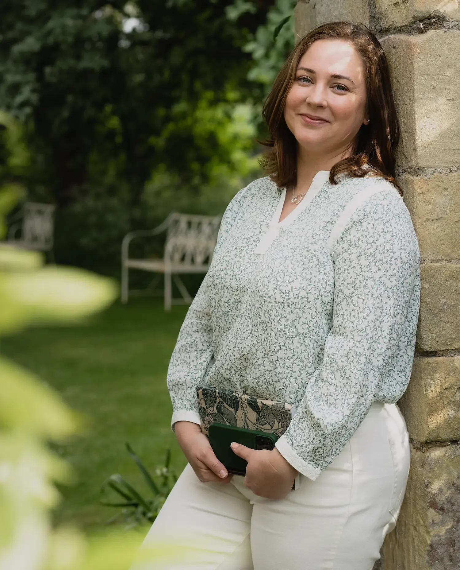
When Kerianne Fitzpatrick left the corporate world to launch Studio Fitzpatrick, a garden design studio in the South East, she needed a brand identity that gave her the same confidence as her design work. The brief: give her fresh assurance in her new season as a business owner, not just a service.
The brief
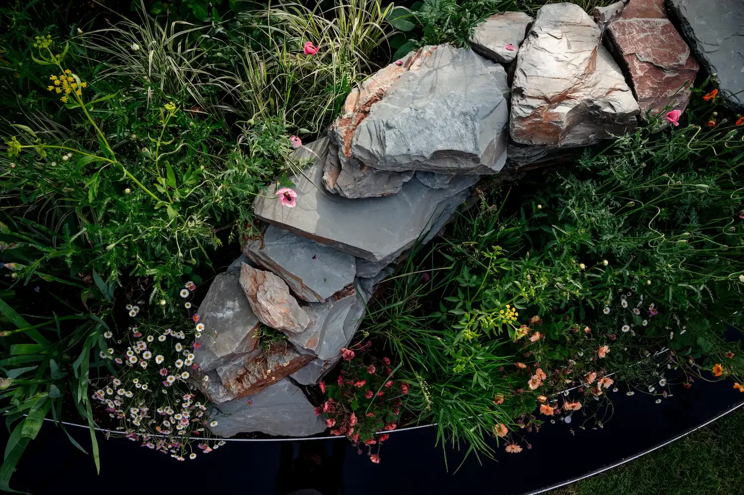
Small gardens can be some of the toughest to design, with space at a premium across many urban areas. The strategy centred on positioning Keri as an expert guide rather than a service provider, helping homeowners see potential in spaces they'd otherwise dismiss as awkward or unworkable.
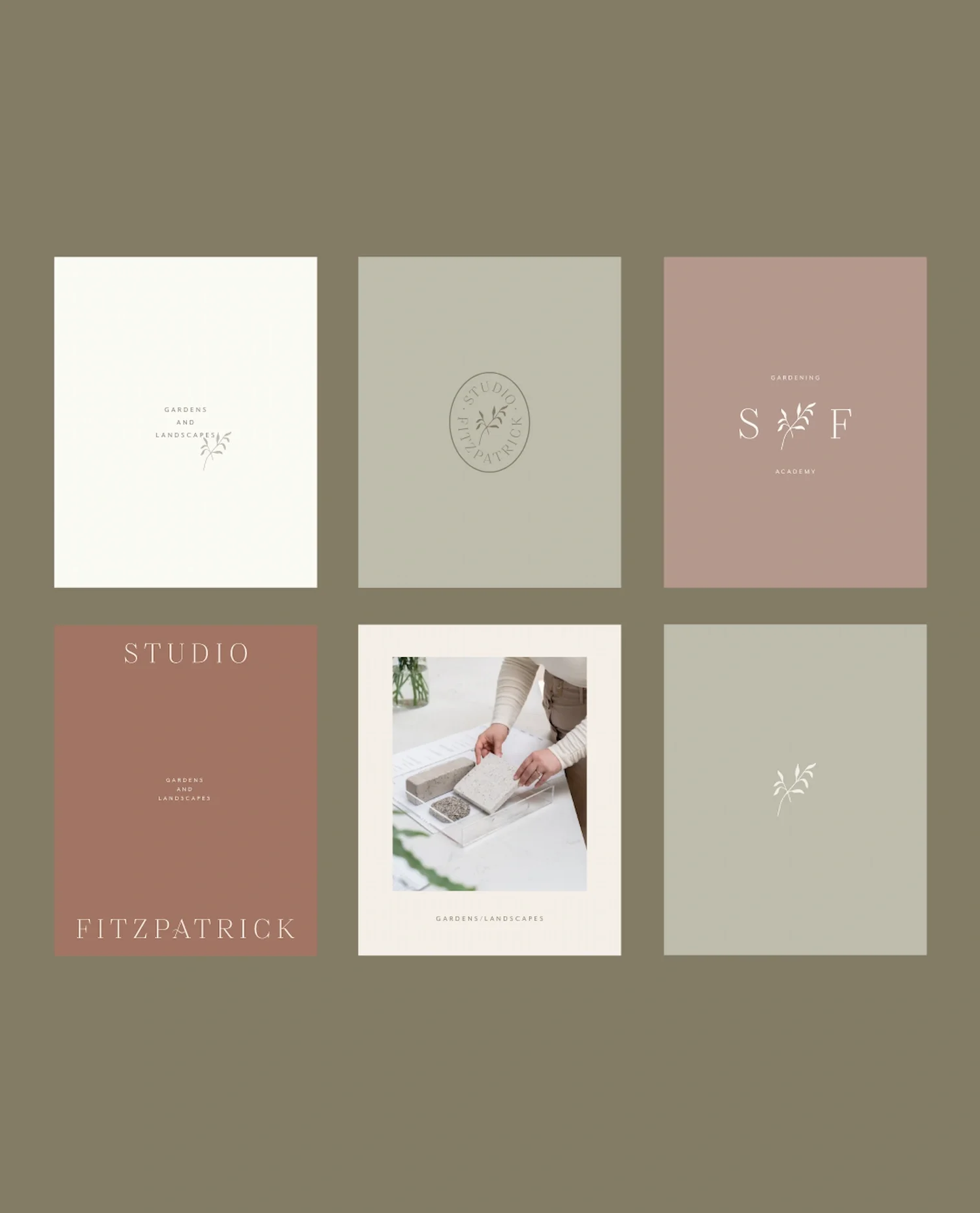
Brand identity
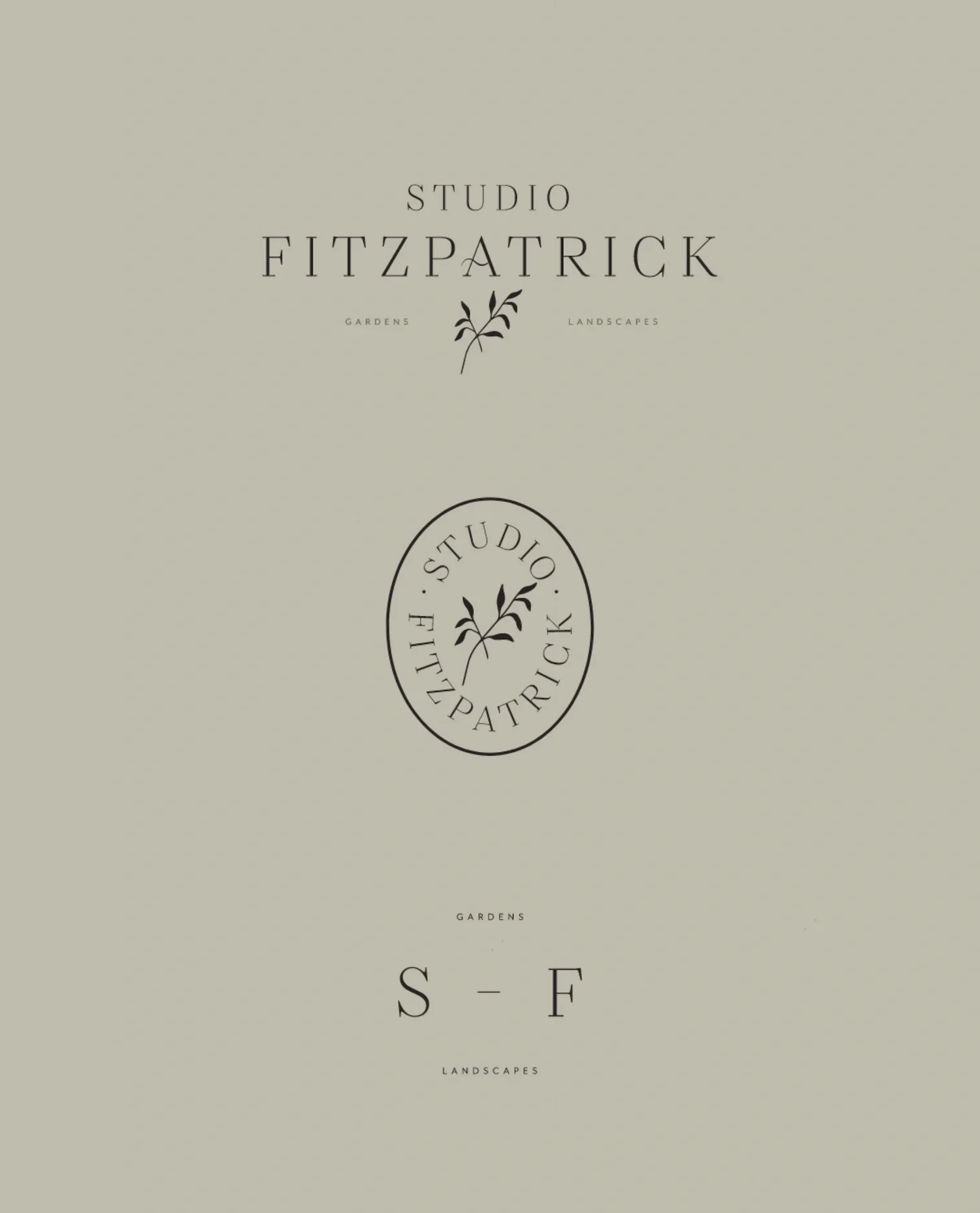
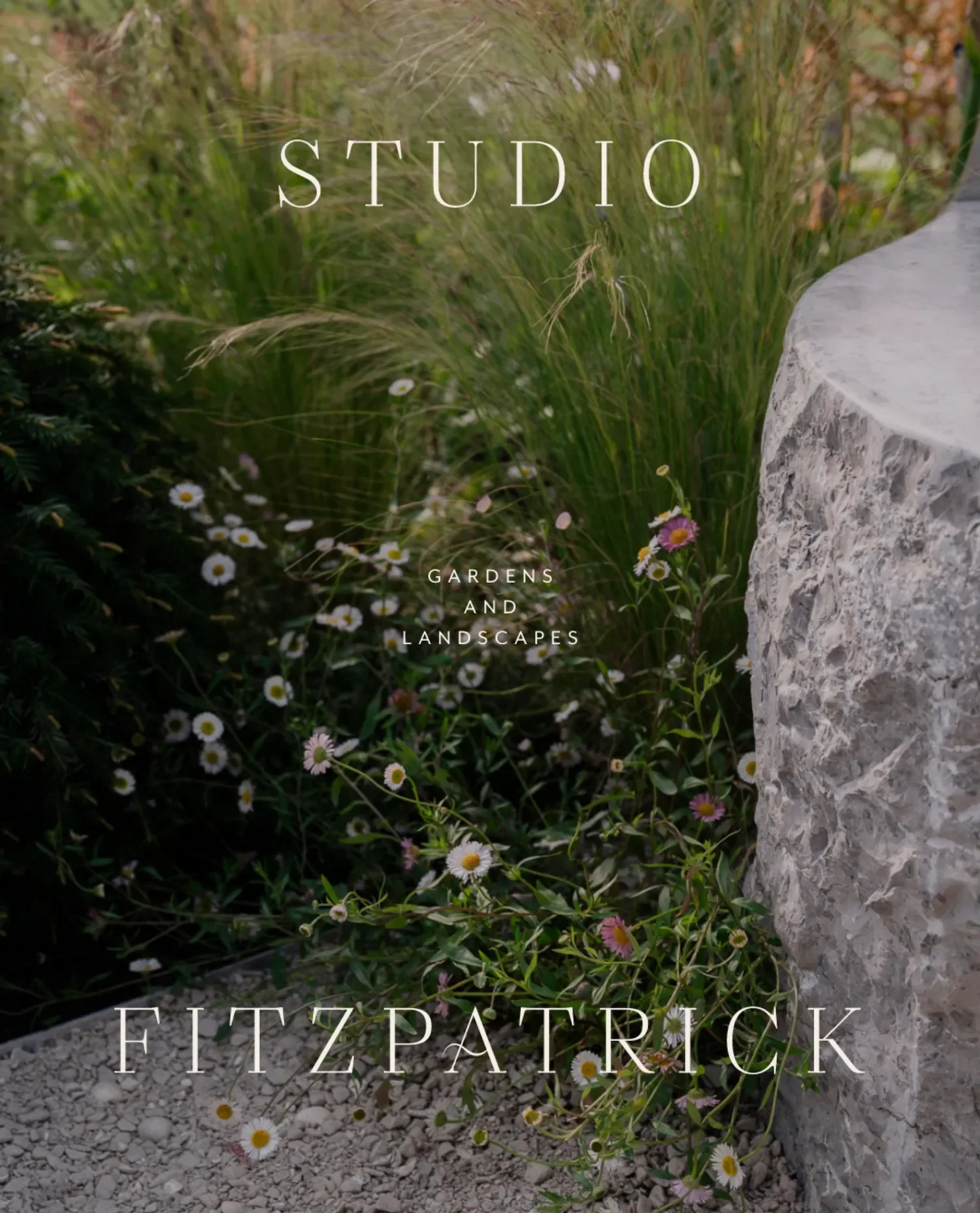
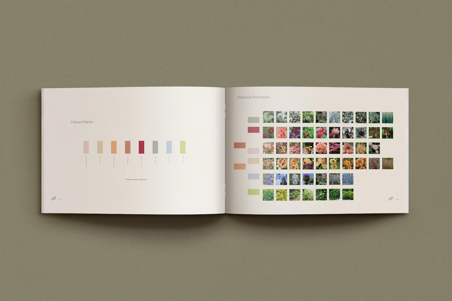
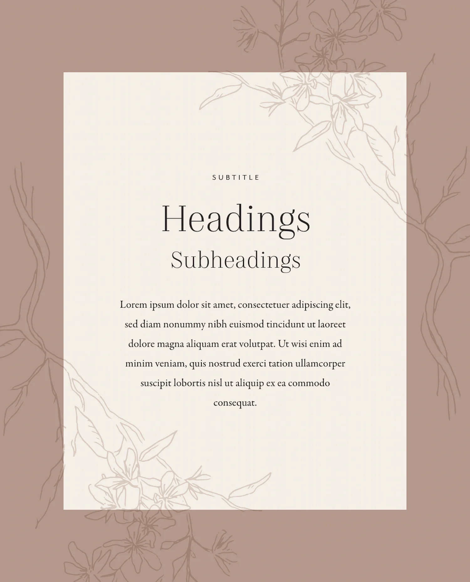
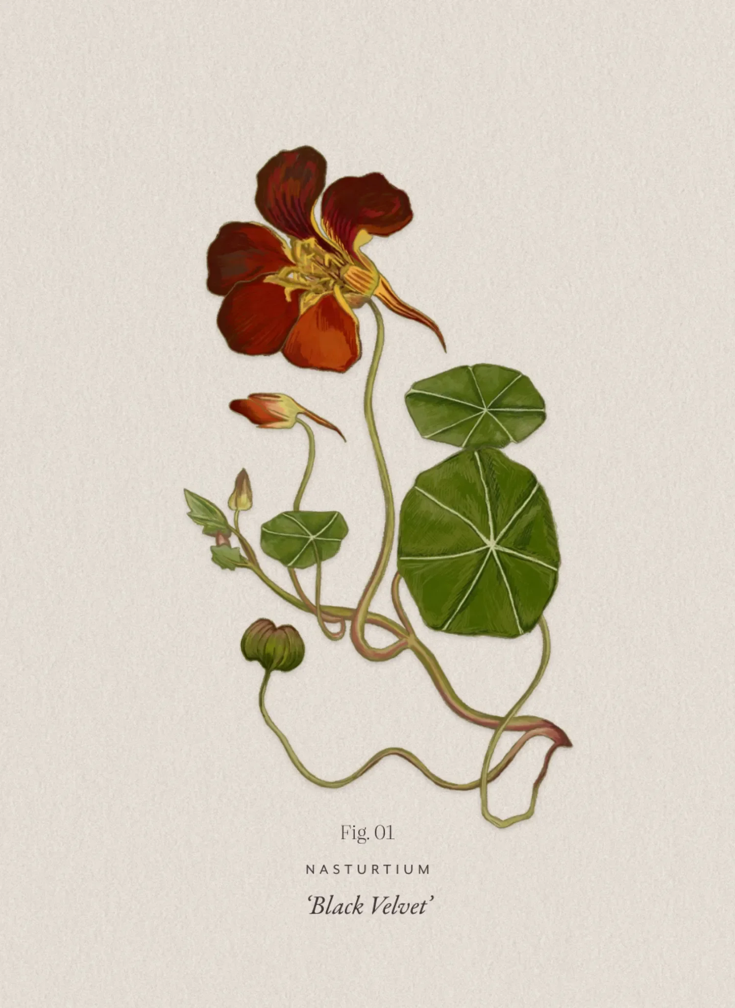
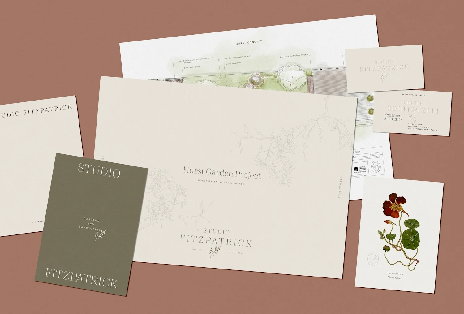
We built a brand identity around a muted, warm palette (cream and French grey balanced against olive green and dusky pink) paired with refined serif typefaces for a restrained, elegant feel, one that reads as considered rather than decorative, holding up whether it's on a business card or a show garden panel.


Website design
A phased website design followed, starting with a landing page ahead of a major show garden appearance, then expanding into a full site with an integrated blog. Keri contributed her own voice to early content drafts, keeping continuity between her writing and ours as the site grew.
Behind the scenes, we set up an online booking system with payment processor, so paid consultations could be arranged without back and forth emails. A separate booking option was added for informal introductory calls, giving Keri two clear paths depending on how a prospective client wanted to get in touch.


Social & print
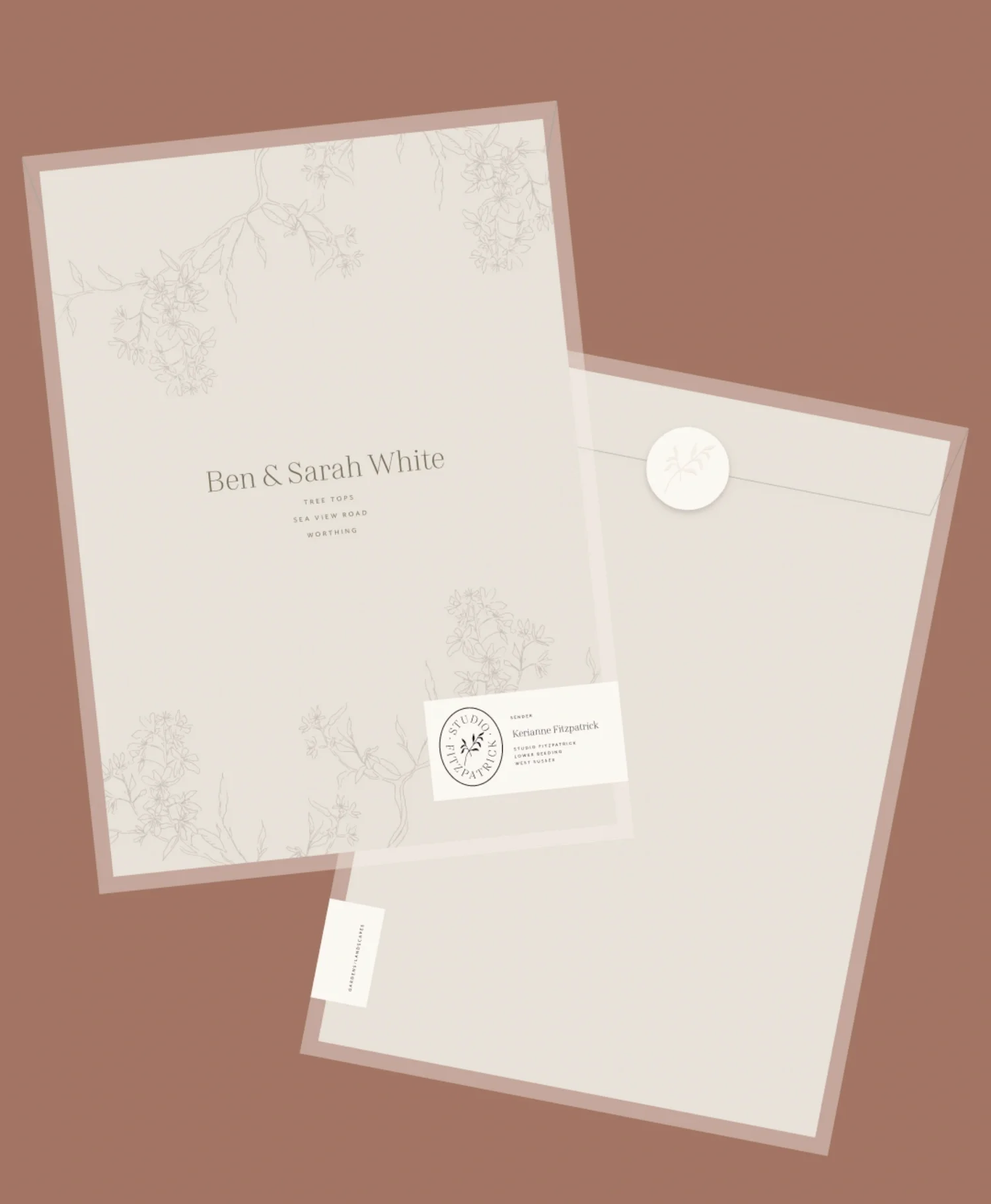
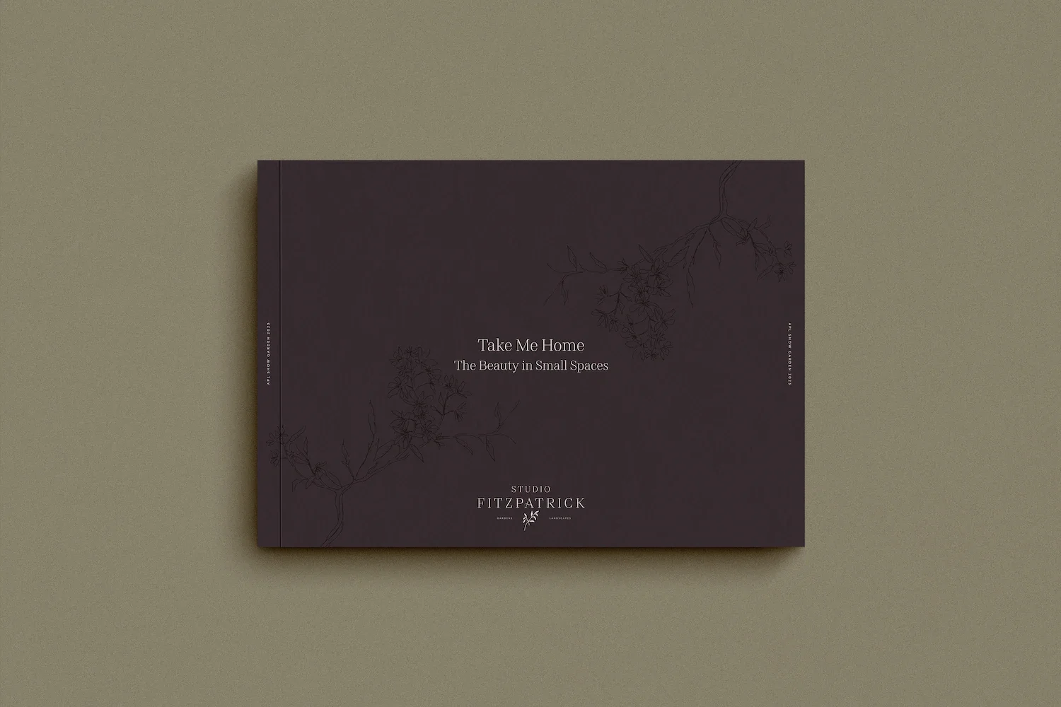
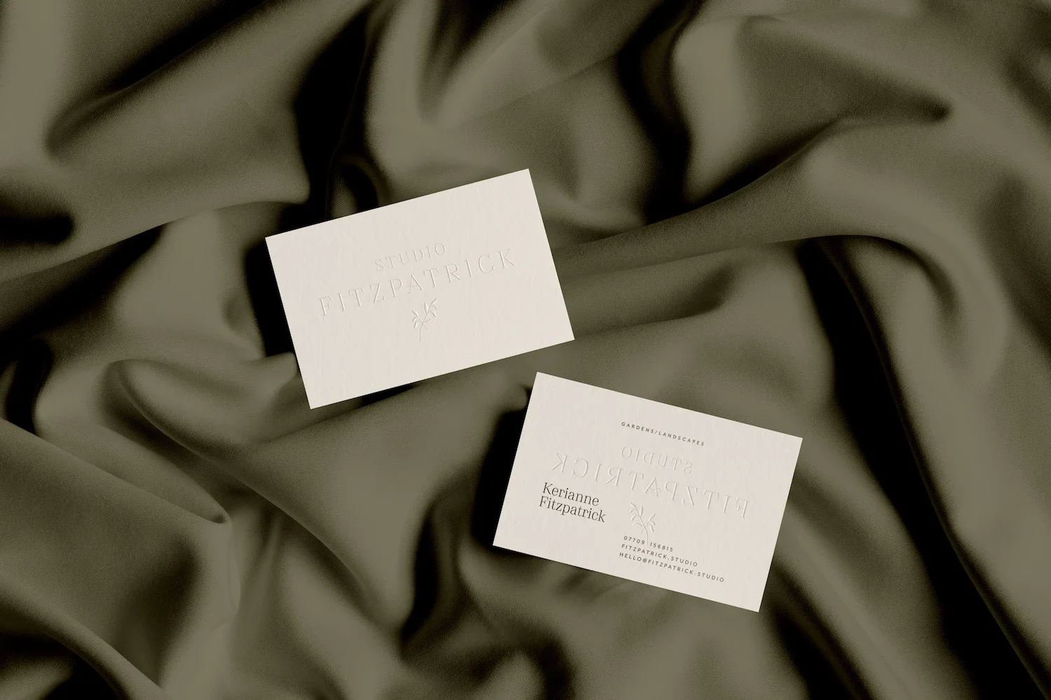
Instagram templates, built in Adobe Creative Cloud to match her existing tools, gave her social presence the same polish as the website design. Print assets followed, including business cards, postcards and stickers finished with blind emboss and foil blocking, extending the restrained brand identity into physical materials.
The impact
The results were quick to show. Within weeks of launch, enquiries began landing from her own village, a sign the new website design was working exactly where it mattered. Keri described the process as a genuine confidence boost, motivating her to pursue growth she might once have hesitated to chase.
Rounding off
Studio Fitzpatrick reflects how we work with garden designers, architects and interior designers alike: pairing a restrained, considered brand strategy with a website built to attract the right enquiries rather than just traffic. It's proof that a small, well-positioned studio can compete on trust and clarity rather than volume.
Let’s work together
If your interior design or architecture studio is ready for a brand and website with the same restrained elegance as your work, we'd love to hear from you.